


Organize Chrome Browser Tabs Like THIS! (No More Bookmarks)
Here within Google Chrome, there's a good chance that you're making use of the bookmarks bar. It's the easiest way to get to the websites that you frequent very often, but there may be a problem with this setup.
Now, we have an awful lot of tabs we need to manage up top, and the bookmarks bar area can get crowded very quickly. So, let's take a look at an alternative that I think makes so much more sense.
Here in my Google Chrome browser I have something here called G Productivity. You can see that it's listed here within the bookmarks bar, but when I click on it, it's going to automatically launch the three tabs that I want.
Now, that might not sound that impressive, but the better thing here is if I click on G Productivity, it's going to minimize everything within there, and I can move it anywhere that I like.
So, for example, if I want quick and easy access to my Gmail account, my Google Calendar, and my Google Tasks, but I want to minimize it when I don't want to see any of those notifications or any of those tabs, I can do so.
Now, what I am using here is called grouped tabs. Now, that's not anything new, but what is new is that we can now save those tabs, and add them to our bookmarks bar.
For example, here I am viewing my Gemini account, and perhaps I'd like to include it with this G Productivity group. What I'm going to do is just drag it over, and you can see that red color is now appearing over that tab.
I can put it in the order that I want, and then release it. Now, when I minimize or maximize this group, Gemini is included.
And, remember, you don't have to keep it up here. If I go and say "Hide this group," it's no longer appearing in this tab, but it will always appear here within my bookmarks bar. Let's create our own tab group here.
Maybe I want to keep my social media pages together because I always want to review them at the same time. All I need to do is right click on one of those tabs, and say, "Add tab to new group."
I'm going to select this option here, and I can name it. I'm going to name it "social media" in this case, the default color is going to be gray, but let's make this one blue.
And, the next step we want to take is to enable this toggle, "Save group." This is that more recent feature that we didn't have available to us in the past.
By selecting this, now, this will be added to my bookmarks bar. I'm going to go ahead and just drag in my LinkedIn and my Twitter tabs here. So, again, we have that same functionality available to us.
And, if I want to go ahead and open up that G Productivity, I can do that. Maybe I prefer to have that in the far left. I have saved so much real estate. I've got a grand total of seven tabs here that I can access them in just an instant, whenever I need to.
But, I'm not distracted by the number of unread messages or other alerts that I may see, but they are so much easier for me to get to.
So, if you want to clean up your bookmarks bar, and group relevant tabs together, be sure to experiment with Chrome tabbed groups, and let me know if you have any further questions in the comments down below.
Thank you so much for watching, and remember, being productive does not need to be difficult. In fact, it's very simple.
How to Create AI Presentations that'll Wow Your Audience!
Are you sick of wasting so much time creating that new presentation?
And do you wish that someone else could take care of all of the design and formatting? Well, with the help of AI, you can create stunning and amazing presentations in a matter of seconds.
And in this video, I'm going to show you how. What we are using is a tool called Gamma. You can find it at gamma.app.
And once you've signed into your free account, you can get started with Gamma in a few different ways.
You can always paste in some text if you already have an outline, or perhaps you want to import a file either from Google Drive or maybe upload an existing Word doc or a PowerPoint file.
But in our example, we're going to use the one-line prompt to create a complete presentation from just a simple set of instructions. So I'm going to click this one in the middle, and my first choice is if I would like to create a presentation or maybe something else completely.
You can create documents and webpages with Gamma as well. But in our example, we are going to stick with a presentation. Now down below, I can enter in the prompt I want.
I want to produce a presentation that is going to help entrepreneurs to overcome that feeling of overwhelm and help them to simplify their to-do list.
So I've put in that information here, and just before I hit Generate Outline, I can double check the language it is going to be using and I can also specify how many cards it will produce.
Now, Gamma uses the term cards instead of slides. So in this case, we are going to be producing eight cards.
If I think that's too much or too little, I can always adjust this here or I can also adjust it once it has generated the presentation for me.
I'm going to select Generate Outline, and it's going to take that one-line prompt and give me a complete outline of my presentation.
So if I want to change anything here, I can click on any one of these titles and edit them to my liking. Maybe I don't want to say time management techniques to reduce overwhelm.
I'm going to say to reduce maybe stress in this case. And if I want to reorder them, I can do that here as well. So for example, maybe I want the tools and resources to come first. I can simply click and drag and put this in a better order to my liking.
Remember, nothing we do here is absolutely final, but it can give us a better outline to get started with. Down below, we've got a few other options we can choose from.
For example, we can decide if we want less text per card, if we want a medium amount of text, which is probably recommended to get started, or if we want a lot of detail.
And then down below, we can choose our image source. Now, this is one that you're not going to want to miss.
Now by default, it's going to scour the web and look for appropriate web images, but I really like the AI images feature because it's going to generate original artwork and original graphics specifically for my presentation.
So let's choose that option and see what it comes up with. I'm going to click on Continue at the bottom of the screen. And our last step is to choose the theme we would like for our slideshow.
And this is where I think Gamma really hits it out of the park, especially when it comes to comparing it to other AI-generated presentation tools. There is an awful lot of themes for us to choose from.
We can filter it by a few different options here, or we can select this shuffle theme and just see if there's a few that stand out to us once we hit that shuffle button.
Now, although I'm not exactly sure how to pronounce this, I kind of like this theme here, a mix of greens with a dark background and light font.
Next, I'm going to select this Generate button and Gamma will start to produce my presentation in real time, taking all of the information that I gave it from a single prompt and put together a complete presentation, which I can start to use right away.
Now, the reason why I recommend that you start with the AI image generator is that the colors will be spot on with the theme that you choose. I think this is a fantastic background image for the title of this slide "Understanding Overwhelm".
If I skim down below, you can see that this is a very complex image here on the right-hand side, probably fits fairly well with the power of simplification. But again, as the case with most AI images, you may want to double check.
Of course, your presentation is so much more than just the design and the graphics. You can now come in here and adjust any of the text, move things around, remove things if you need to as you refine your presentation.
But wait, the AI doesn't stop here. We can continue to use AI to help us refine our presentation.
On the right-hand side of the menu where we have a number of editing options available to us, at the very top, there is an edit with AI button.
What this will do is bring up a prompt, which we can use to expand on more detail or ask it to change this image, or maybe make this a bit simpler. For example, on this card here, maybe I think that this title is a little boring So I'm going to say, "Make the title a little more exciting," something like that.
It's going to take just a few seconds and give me some options to consider. So do I want to change the color or do I just want to change the title itself? I'm going to go with a suggested one here, but I can always come back in here and change that default color.
If I want to go back and say, you know what, let's go with the one that is the same with the rest of the slides. Let's do that here. But it's going to give me some suggestions that I don't have to go with, but I can choose before applying to my slides.
Now, when we're happy with our presentation, there's a few different ways in which we can share it or present it to others. We can come up here and select this Share button and send a link either to those we would like to collaborate with on, or we can share the finished product with them so that they can just view it.
But we can also export it to popular tools such as Microsoft PowerPoint, or perhaps you'd like to download it as a PDF. We can do that here as well.
But you don't have to do any of that if you don't want to. Here, we can select the present button and immediately start to share our presentation perhaps in your favorite video conferencing tools.
Now things get better though when it comes to sharing or presenting your slides.
Here just to the left of your profile picture, you can actually view analytics for your presentation. So for example, you can see exactly when this presentation was last viewed, but if I come up here and select Card Engagement, I can see exactly how long people have spent on each one of these cards.
So if I'm sending this out to a potential customer or a client, or maybe just someone within my own organization, I can see exactly what is keeping their attention and even if they completed the entire presentation at all.
So if you're ready to make your presentations, documents, and webpages look amazing in a fraction of the time, go to gamma.app to get started for free.
Thank you so much for watching today's video. And remember, being productive does not need to be difficult. In fact, it's very simple.
How to Sync Google Contacts to Pipedrive CRM (Easy Setup)
If you already use Google or Gmail for your business, you know that you can use Google Contacts as a simple CRM. Here in my example, I've got a number of special labels including New Leads, Qualifying, and WON.
Special Labels
However, there are some limitations here. For example, if I want to change Blair to a qualifying lead, I could take his name and just drag it into Qualifying, but it actually just adds that label. It will never remove the New Leads label. I've got to come over here and manually remove that as well. You will also see, if I go over to the Qualifying area and click on Blair, I'm pretty limited with the history and the amount of information that is available to me.
Why Sync
That's why I recommend syncing your Google Contacts account with a true CRM system such as Pipedrive. So let me walk you through how you can sync your contacts from within Google Contacts, so that they will show up and appear here within Pipedrive.
How to Sync
Inside your Pipedrive account, we want to come up to the top, right-hand corner, select your profile picture, and then select Personal Preferences. And on the left hand side, we want to come down to about the fourth option called Contact sync.
Now it's true, you can sync your contacts with other platforms, including outlook.com or Microsoft Office 365, but in our example, we are going to sync it with Google.
To get started, we can select this Add New Account button, and all we need to do is enter in the email address of the account we would like to connect. I'm going to select Continue here, and next, we will be presented with the standard Google sign-in screen.
I'm going to choose the correct account here. I'm going to give it the permissions that it is requiring. I'm going to select Allow, and then we are brought back to our Pipedrive account.
Sync Settings
Now, before it can start syncing with your account, we want to take a look at two particular settings. The first one is which group of contacts would we like to sync with Pipedrive. By default, all contacts will be selected, but perhaps you don't want to sync all of your contacts.
n my case, I only want to sync those that are new leads. So I'm going to come over here, select this dropdown menu, and we will see all of the labels within our Google Contacts account. I'm going to select New Leads in my example, and then next, we have a choice in terms of the sync direction.
We can choose a one-way sync, where Pipedrive will only receive new contacts that are added within Google Contacts, or we can choose a two-way sync, meaning that contacts that we create within our Pipedrive account will also be synced with that account.
In our example here, I'm going to select One-way, but you can choose which one is best for your case. At the bottom, I'm going to select Start syncing. It will give me a brief warning that Google does have a limit of 25,000 maximum contacts.
If you are anywhere near this number, please let me know in the comments, but for most users, this is a pretty healthy maximum. I'm going to select Enable contact sync, and immediately, Pipedrive will start to sync those contacts between your Google account and here within Pipedrive.
Now, depending on how many contacts you are syncing, this could take up to a minute, but in our example, it is pretty small. Here it's telling me that the last sync was a few seconds ago, four total contacts are in sync, three were added today, and one was updated today.
And if I ever need to come back here and change my settings, for example, if I want to change to a two-way sync or to add other labels, I can do so here, or I can choose to stop the sync as well.
New Contact
Now, when we come to our contact section here within Pipedrive, we have a few extra contacts that are being brought in here from Google Contacts. Let's go ahead and create a brand new contact just to see how quickly this sync is working. So I'm just going to call this one New Contact just so we can find it over in Pipedrive. And let's make sure we have that New Lead label, because remember, that's the only label that's going to bring that contact over.
Save
I'm going to go up here and select Save, and of course, it may take a few seconds, but if I go ahead and even just refresh this page here, now you can see that that new contact that was created in Google Contacts is listed here. And once it's in Pipedrive, I can add detailed notes. I can add activity and track that activity. I can even go ahead and email and manage all of my email conversations right here from within Pipedrive. So I have so many more options available to me, so I can win this deal and keep generating more business.
Conclusion
Now, if you're not already a Pipedrive user and using these powerful Google integrations, I’ve got good news for you. You can get started for free, and Simpletivity viewers get an additional 20% off of their first year. To learn more and get started, click the link in the description down below.
Thank you so much for watching today's video, and remember, being productive does not need to be difficult. In fact, it's very simple.
5 PowerPoint Add-Ins to Make Your Slides Look Amazing!
With just a few simple add-ins, you can make your PowerPoint slide shine and also make your life a lot easier. So in this video I'm going to share with you 5 PowerPoint add-ins every user should know. Let's get started with add-in number one.
Add your own QR codes
And this has all to do with making it easier for people to go directly to a website or a URL. How often have you had a slide like this where you are inviting people to go to a particular form or a survey or a website?
And even if you create this as a link within your PowerPoint deck, it does no good to your viewers because they can't click on this when they are watching your presentation, whether it's in person or even if they're watching it online.
Well, if we come up to add-ins, we are going to make use of a tool called QR4Office, which makes it quick and easy for us to add a QR code to any of our slides.
So in this example, all I need to do is come up here and type in the name, or maybe I could copy and paste the name of the URL where I want people to go. So I'm going to type in Simpletivity.com/streamline.
Now, down below, we do have a few additional options. If I want to match my own branding or change the color, I can do so here, I can select that blue. And then I would recommend adjusting the size here, not the image that it's going to produce.
When it comes to working with QR codes, you want to make sure that these pixels, these shapes are as accurate as possible so that everyone can access it from their phone. When we're happy with our color and our size, all we need to do is select insert, and it will immediately be inserted into our slide.
Create amazing timelines with Office Timeline
Next on our list, let's take a look at making timelines so much better. Now, here within PowerPoint, you may be familiar with the ability to insert a simple chart or insert smart art. And, yes, there are a variety of different timelines which we could include, but they are all very, very basic.
And even once you've set up your timeline, like the example I've got here, if I want to adjust this review date, if I go to drag this over to the left, oh yeah, everything is separate. These are all just individual elements. I got to come down here and separately drag the text for that.
And this April 15th, if it's actually April 1st, I'm going to have to manually change that as well. Well, what if you could create a timeline that looked like this, that had a lot more detail, that was a lot more visually engaging, or maybe a timeline such as this?
To create these types of timelines, I'm using an extension called Office Timeline. And best of all, I can go into this timeline and start to adjust things any way that I like. Let's take a look at this executive decision here. And let's say I need to move the date into May. I'm going to click and drag it.
And not only is everything staying together, but do you notice that the date is changing as well? Even if I need to move it way over here closer to the executive review, it will automatically raise it up so it's easy to read. And best of all, I can do this with any element within that timeline.
Maybe I want to highlight this final release, but I want to bring it down here within the product development space. Everything is brought together, the text, the images, everything on screen. And if I want to dive into the data, I can come up here and select the data tab. And here I can change the text, I can change the shapes, I can change the colors.
I can come in here and change the dates. And better yet, I don't have to type it in. It gives me a nice convenient calendar as well. But perhaps the biggest time saver with using Office Timeline is that you don't have to create this at all. You can let it do the work when you upload your own spreadsheet or your own data.
I'm going to come up here and select Import. And here you can see a variety of tools which you can import and sync with directly. And if you don't use one of these tools, almost everything will export into Microsoft Excel. Meaning, that you don't have to continually update your data in two different places.
You can update it once in your spreadsheet and make sure that it is represented right here within your slides. To learn more about Office timeline and any of the add-ons in today's video, be sure to check the link in the description down
Build a presentation with ChatGPT
Now, the third add-in in our list today is going to help prevent you from staring at a blank slide. And for this, we're going to take advantage of AI. ChatGPT for PowerPoint allows us to give a particular prompt or just a few set of instructions and create slides in a matter of seconds.
To get going, we can either start from our own topic, or if we already have some text or an outline, we can go and paste that in here. But I'm going to use this create from topic in our example today. Here within the prompt area, I'm going to say "Highlight the pros and cons of waking up extra early and its effect on your workday."
Now, we have a limit of 250 characters, so I could put in a lot more description if I want to. And then down below we have two other choices available.
We can choose the language in which we want the slides to be produced in. And then we can also choose the number of slides. I'm going to leave it at the default of seven and select continue.
What it's going to do first is create an outline so I can review this before it goes ahead and produces the entire presentation. So here you can see here are the titles of each of the slides, early wake up pros and cons, this is probably going to be a title slide, the benefits, the challenges, the impact, healthy morning routines, tips for successful early rising.
Now, I can go in here and change any of these titles if I want. I can also come here to the left and change the order as well. So maybe I want healthy morning routines to come at the end before the conclusion, so I can add items if I want or remove them. But let's leave them as is, and I'm going to select Continue.
Lastly, we can choose a particular template. Now, the templates are fairly basic, but remember, you can swap these out with any of your PowerPoint templates here as well. I'm going to choose the first one and select Continue.
Now, it may take a few seconds depending on how many slides which you have asked it to produce, but really this will probably produce my slides in, oh, a little less than 15 seconds. Here you can see it producing it for me live on the left-hand side, and it's even incorporated pictures as well.
So I've got my title slide, here's the benefits, here's the challenges, appropriate images, appropriate bullet points. Of course, I would never just go ahead and produce this as is, but this gives me a great framework to go on.
So if you are stuck or want to get ahead just a little faster, you may want to check out ChatGPT for PowerPoint.
Create word cloud images from text
Next, let's take a look at how we can make our slides that much more engaging and useful for our audience. In this example, I've collected a number of responses. Maybe I surveyed my participants in advance, or maybe this is just some user data and I just have the raw outcome here.
These are the answers that people gave, but this isn't very engaging, and it's actually kind of hard to see what were the most popular responses. Well, I'm going to produce a word cloud in just a few seconds, and it's also going to give me a lot of helpful options along the way.
For this, we're using something called Pro Word Cloud, and all we need to do is select what kind of font we want to use. Maybe I'm going to use this telephoto font here. I can choose from a variety of different color schemes if I want. I'm going to keep things pretty simple here. I'm going to choose this celebration one.
I can change the case layout or my case preferences. I can even limit it to a number of words, If I have more than 100 in my list here. The one thing I would make sure that you do is actually increase the default pixel size I'm going to put 1000 by I think 800 in my example here, just so it takes up most of my slide.
And then the last thing that we to do before selecting this button is to actually come over and select the words you want to use in that word cloud. So I'm going to come over here, I'm going to select create word cloud, and instead of putting it directly within my slide, it's first going to give me that image up above here.
And this is helpful in case I want to tweak any of the design options down below. But when I'm happy with the result, all I need to do is click on the image, it copies it to my clipboard and now I'm going to say paste here within my slide.
Now, I've got something which is a lot more engaging, a lot more useful. We can quickly see that joy and peace were the two most popular words, and things like success and abundance were much less popular in this particular poll.
Add free stock images by color
Next, let's take a look at making it easier to add images to our slides without having to copy and paste from different websites or traveling to other tabs within our browser. For this, we are going to use the free Pexels add-on.
Now, Pexels has been a very popular site for getting free stock photos, but instead of minimizing and maximizing your PowerPoint slides, we can search all of those photos directly from within PowerPoint.
So, for example, maybe I want a picture of a computer. I can type in that search, and then I can preview all of those images here right from within my application.
But the feature that I like the most is that I can color match my images. So here on the left-hand side, you can see I've got this very dark background with this purple theme going on in the left and right lower corner.
So within the Pexels add-on, I'm going to select this color picker, and I'm going to select this purple, which happens to be the same purple as the one within my slides.
And maybe I want to look at something like a monitor screen or something along those lines. I'm going to type in the word monitor, and what it's going to do is bring back a number of images that are related to a monitor, but that have that type of shade or that type of tone within it.
So as I browse through these, I can see that all of these are going to fit very, very well with this slide on the left-hand side. I'm going to select this image here. I can choose from large, medium, or small. I'm going to go with medium. I'm going to say insert photo. And maybe all I need to do here is say send to back.
And that looks great, and it fits very, very well with the other colors and the other themes that I have on screen. So if you want to quickly find the right photo for you, be sure to use the Pexels PowerPoint add-on.
Now, I would love to hear from you next. Which of these five add-ons were your favorite? And do you have any that you would like me to feature in a future video?
Be sure to let me know in the comments down below. Thank you so much for watching today's video. And remember, being productive does not need to be difficult. In fact, it's very simple.
How to Archive Trello Cards & Lists (and Unarchive later)
How do you archive Trello cards and lists? And perhaps more importantly, where do you go to find those archive cards and return them to your board? In this video, I'm going to show you everything you need to know. Now there's a few different ways in which we can archive our cards.
Archive Cards
Number one, you can open up your card and scroll near the bottom and you can see that there is an archive button here, which we can select. By selecting this button, we can scroll back to the top and we have this identifier telling us that this card is archived. If we want to return it to our board, this is synonymous with unarchiving a card. I can select this option. You can see that that label is now removed and this card remains on this board.
Fast Way
Now there's a faster way in which we can do this. From the front of our card, we can select this stylus, and here you can see there's an archive button here as well. But the fastest way to archive your Trello cards is to use a shortcut key. If you hover your mouse over a particular card and select the letter C key on your keyboard, that will instantly archive that card.
Undo
Now you'll notice down below we get a warning where we can actually undo that action if we want to. This can be very helpful if you accidentally hit the C key on your keyboard over a card when you didn't mean to archive it, and you can select Undo.
Now, while it is common to archive cards one at a time, there may be some cases where you will want to archive an entire list. A good example of this would be a completed list, a finished, a done, a published, any list that may be accumulating a large number of cards that you don't really need to see anymore.
Well, at the top of any list, we can select these three dots, this more menu, and come down to the bottom. Here, we can choose to archive all the cards in this list, but notice that we also have an additional option with a very specific distinction.
The last option here is to archive this list, meaning archiving not only all of the cards, but the list itself. If I go ahead and choose this option, it will remove that entire list from this board.
What is Archiving
Now, at this point, you may be asking yourself what exactly is archiving and why should I consider doing so? Now the good news is, is that by archiving any of your cards or lists, it is not the same as deleting, nor does archiving put it in a temporary state where it will be deleted in 30 days.
The most common use case for archiving cards is when you no longer need something viewable or no longer need something here within your Trello space.
Searchable Cards
Every card that is archived will remain searchable, so you can go back and find it and reference it at any time. If I come up here to the search bar, I'm going to type in the words meeting minutes 'cause I'm looking for a particular card with that title.
Here you can see at the top, I have found the card I'm looking for. It's from this board and it's telling me that it has been archived. By clicking on this result, it will open up that archive card, which is completely preserved with the way that I had it before.
So I can go through and reference and look at this information, and if I want to return it to my board, I can come down here and select send to board. But what if you don't know the search term? What if you want to see all of the cards which you've archived within a particular board?
Archived Items
Well, in that case, we can come up to the board more option and the third option down within the menu is archived items. By selecting this, you will see a complete list of all of the cards which you have archived.
You can scroll down and find the one that you desire, you can immediately send it back to the board if you want here, or you can choose to permanently delete by selecting the delete link. Now, what might be more helpful is to use the search feature here at the top.
This search field is only going to search archived items for this particular board, which differs from the global search up here, which will search all cards, lists and boards within your Trello account. But while we're here within the archive area, you'll also notice that there is a switch to lists button.
By selecting this, it will show us all of the lists in which we have archived and we are only one click away from sending them back to the board.
Remember this waiting for list, which we archived a few moments ago? I can come over here and select send to board, and not only is the name of the list restored, but all of the cards that were within that list when it was archived will be returned as well.
So now that you know everything about archiving cards and lists within Trello, what other Trello questions do you have? Be sure to let me know in the comments down below.
Thank you so much for watching and remember, being productive does not need to be difficult. In fact, it's very simple.
How to Organize Gmail with Multiple Inboxes (Tutorial)
Big thanks to SaneBox for sponsoring this video.
Using multiple inboxes here within Gmail is a great way to highlight your most important messages or to make sure that things that get labeled don't get buried here on the left hand side. So how can you add multiple inboxes and configure them for the way that you want to? It's actually a lot easier than you think.
Here in the top right hand corner of the screen, we can click this gear icon, and if we scroll down, you'll notice that we have a number of different ways to view our inbox.
Now you're probably most familiar with the default view where we have all of our messages listed here in a linear fashion. But we have several views to choose from, including the last one here called multiple inboxes.
In my example, you can see that I have two of my labels, "Action Required" and "Waiting for Reply" displayed here on the right hand side.
And the great thing is that whenever I need to add a new label, so for example, maybe I'm going to select this message here and I'm going to say that yes, I need to deal with that, it's immediately going to appear here within this action required section, not get buried over here and force me to have to remember to come and click and select this label.
I also have a second one here called "Waiting for Reply". So these are perhaps messages that I've sent and I want to make sure that I follow up and don't miss their replies so I can see them here as well.
Now the nice thing is that we can continue to minimize these sections if we don't want to see them as well. Maybe I only want to see "Action Required" and not "Waiting for Reply".
Well, we can do that as well. And if we hover our mouse here between the divider, we can adjust the size and the display. But let's go back to our setting here.
We're going to come down to multiple inboxes, and once you have this selected, we want to come here and select Customize. Now, this is where we can decide what will appear within our multiple inbox section. Now note, you are limited to a maximum of five different sections.
You can customize how they are named, and we can even choose in terms of how many conversations will be displayed at a given time, because depending on the label or the search query that you choose, you probably don't want all 125 messages displayed on the multiple inbox section.
So by default it's set to five. I'm going to leave it at five here. And we even have a choice in terms of where it is displayed on the page. But what's most important to remember is how you can add a new section.
It's not quite as simple as just clicking into one of these fields and selecting a label. And the good news is that you're not limited to labels either. So how can you add your own labels or other search criteria? Well, let's go back to our inbox.
And when we click on any of these labels, you'll notice that at the top of the screen within the search bar, it is actually displaying the search criteria. So let's say we want to add the newsletter label to our new multiple inbox section.
I'm going to click on newsletters. And here you can see, all I need to do is come up here and copy this search criteria. And then we're going to go back to multiple inboxes and select customize. And all I need to do is paste it here within section three.
Now, lastly, we can give it a name. You don't have to, otherwise it's going to say this as the section label, but I'm going to continue with my pattern of adding an emoji. I'm going to add a newspaper emoji, and I'm going to say, "These are newsletters."
Let's keep it nice and straightforward. Now, don't forget, don't just click to your inbox at this point. We want to make sure that we scroll down to the bottom and select save changes.
Now I'm brought back to the newsletter label because that's where I was last. Let's go back to our inbox. And here you can see I now have my new section called "Newsletters" right here.
If I want to minimize that, I can, and this is also a good example of where it's instilling that five message limit. I've got over 700 newsletters within this label, but it's only going to display the first five.
Whenever you want to quickly access all of the messages within your section here, all you need to do is select the number here on the right hand side, and that will take you directly to your labels or whatever that search criteria is.
So let's choose a search criteria for our last section because you don't have to add labels. Maybe I want to create a new section here that are all of the messages sent from a particular individual.
I'm going to come up here and select this show search options just to remind you that you can create a very complex filter if you want. In my case, I'm going to insert this particular email address.
I want to see all of the messages that are coming from this sender, but I could add other criteria such as a key subject line in terms of a size, or maybe I just want to highlight all of the messages that have an attachment.
Maybe that might be helpful to you. But I'm going to keep it simple in this example.
I'm going to say search, and yes, it's going to go ahead and find all of the messages from this sender, but all I have to do is come up here, select it, select copy, and then you guessed it, we're going to come back to multiple inboxes customized and under section four, I'm going to paste in that search criteria.
Over here on the side, let's continue with my theme. I'm going to choose this envelope, and I'm going to say, "From Scott." I'm going to keep it nice and simple.
These are all of the messages from this particular sender. Once again, I'm going to come down here and hit save changes. Let's go back to our inbox, and now we have that new section down below. I'm seeing one of five of many.
Yes, there are many messages from this sender, but now I have access to them directly here from within my inbox.
Now, if you are still feeling overwhelmed when it comes to your inbox, I suggest that you check out SaneBox. With AI technology, SaneBox prioritizes essential messages, saving you hours of time each week, and by learning from your behavior, SaneBox will clean up your inbox, get rid of spam, and organize your emails into relevant folders.
Best of all, SaneBox works with any email provider. To get started, click the link in the description to get your free 14 day trial.
How to use Gemini AI with Google Workspace (Gmail, Drive & Docs)
Is Google's new and improved Gemini AI really better than ChatGPT?
Well, if you're a Google user, the answer is yes. Before you get started with Gemini, come on down to the left hand side and click on settings and then select extensions.
And there's a number of Google extensions that we can enable, but the one that you want to make sure you have toggled on is Google Workspace, because we can do a lot with our email, with our files and folders, even with our specific documents. So let's take a look at an example.
So with my cursor in the prompt area, I'm going to add the at symbol and here you can see we have access to our extensions. Now this is going to help Gemini realize where or what we are trying to do. I'm going to select Gmail.
I'm going to say, review all of my unread email from the past two days and identify the first three that are most important. Maybe I'm coming back from a vacation or several days away from my inbox, and I just want to zero in on what needs my attention now.
What Gemini will do is connect with my Gmail account and quickly identify what it thinks is most important. Now of course, keep in mind, this is AI. It's not going to be perfect, but it can really help us to sort, find, summarize, and do an awful lot with our email.
So here it has come back with the three emails it feels that I should review first, but better than just giving me a summary of its title and its contents, if I scroll down below, I am one click away from actually opening up those emails and responding as well.
So it's made it that much more actionable if I want to. Let's take a look at another example. This time I'm going to hit the at symbol and we're going to select Google Drive and it can often be frustrating to search for the exact file that you're looking for.
Well, in this case, I'm going to ask it to find the Kanban file from last year. I'm going to specify that it is last year, not this year. And let's say, summarize its details in five bullet points.
So there's two things here, right? We are finding, we are searching, a particular file but then I want it to do something with that file as well.
Just like we saw before, it may take a few seconds depending on the complexity of that request, but this was actually a lot quicker. Here are the details. It found the file. Here is the summary of the contents of that document.
And once again, I have direct access. It's showing me exactly the particular file so I can click on it and do more with it. But it gets better because under every single response, you can see we have this share and export button.
Here, I can export this information back to Docs or I can take anything here within Gemini and draft a Gmail in a single click. Now, if you're wanting even more Google and productivity tips such as this, you should join the Simpletivity newsletter.
Just click the link on the screen now and join me at Simpletivity.com.
STOP Wasting $$$ Scheduling Meetings (Use a CRM Instead)
I love to save time, but I also love to save money. That's why in this video I'm going to show you how to save both by combining meeting scheduling with your customer management.
You're probably already familiar with scheduling tools such as Calendly. It's a very popular service used by many. However, it's going to cost you something additional and it's also something additional for you to manage.
So what if you could take all of the functionality here and combine it with a powerful CRM System? Well, Pipedrive, one of my favorite CRM tools, has done just that.
Not only is Pipedrive's Meeting scheduler easy to use, but I feel that the user experience is actually better than Calendly and integrates directly with your contacts and your deals.
Better user experience
Now, before we get into the setup, let's take a quick look at the look and feel because what I love about the meeting scheduler within Pipedrive is that it's big, it's bold, and I think the navigation is even easier for your users.
So here at the top, you can see that we have the title of the meeting. We have the location, and you can add as much detail within the description as you like.
And then down below, rather than having Calendly's default full month calendar, we've got something that I think is a lot easier to navigate. So whether I want to book a time for this week or next week, it's easier to go back and forth.
I'm going to select this Wednesday, and also things stay on the same page. So let's see, maybe 1:00 PM works well for me. Now I can enter in my information and confirm that booking.
Meeting scheduling in Pipedrive
Let's jump back into our Pipedrive Account and see how we can add further schedules and manage our existing ones as well. So here we can find the meeting scheduling option in a variety of different places.
Here I am within my calendar and it will always be available at the top of the screen. If I jump over into one of my deals, let me jump into this deal here. Remember, we can email any of our clients directly from within Pipedrive. And from within my email, I can always add my meeting scheduling link here as well.
And if I happen to be viewing some of my contacts, once again, I have access to that meeting scheduling link because we can email from a variety of different places right here from within Pipedrive.
Creating your meeting link
So I'm going to come here and select Manage availability. Here is the Discovery Call that I set up already, but let's go ahead and create a new scheduling link. So our first option here is how long should this meeting be?
And let's say I want to make this 30 minutes in length. I'm going to choose that option here. When is this availability going to be active?
I can either set a future date or say that I want it to be active from right now, and I can either put this out indefinitely or maybe I only want to make this particular meeting, this particular call available from now until the end of April.
Again, you can always come back in here and edit any of these options.
Then thirdly, we can choose what days of the week. Do we want to be made available for these meetings? Well, I'm going to come down here to Tuesday and unlike Calendly's somewhat complicated way of specifying times and dates, I can simply just click and drag.
Maybe I want to make myself available, 9:00 to 12:00 in the morning, and then once again from 3:00 to 5:00 in the afternoon. So I can do that here.
And rather than hit save and go to another day of the week, right from this same dialogue, I'm going to say I want to add it to Thursday as well. I'm going to hit Save. And now I've got my schedule. I've got my availability listed right here.
Now, before we select Continue to meeting details, it's important for us to select our Buffer and time settings. Now, there's a couple of defaults in here already. We may want to add some buffer time before or after the event.
So if you want to make sure that you have perhaps 15 minutes before your very next event or afterwards, you can choose that here. Here you can choose if the invitee can select times in different intervals.
Now, for me, I prefer things on the half hour. I don't want people booking me at let's say 3:15 or 9:45. But if you have a different preference, you can make that selection here as well.
Then the last two are very important, so don't ignore these two options. The first is the shortest notice to book you. Meaning, if you shared this link right now, could they book you 30 minutes from now?
Well, that might be too soon for a lot of us. So I'm going to say I want a minimum of four hours notice before they can book me.
Meaning, if I sent them the link right now, the earliest they could book me would be about 2:30 in the afternoon, my local time, because it's currently 10:30 AM. And then lastly, how far in the future can someone book you?
Now, unlike Calendly, we have a number of default options here, but I think that this might actually be easier. Do you really need 27 days, or 32 days, or 56 days or a particular number of weeks? We have between one, two or three weeks or a month, two months, or six months in advance.
So maybe the most I want someone to be able to book me out in advance is one month.
Adding meeting details
So I'm going to select that option here. I'm going to select Continue to our meeting details. And this is the final section. This is the last page that we need to configure. The first thing is to give our meeting a name.
So maybe this is going to be a 1:1 Call or a 1:1 Meeting. Here under location, we can either specify where it's going to be a phone call, a Zoom meeting, or in person. Maybe you want to add an address here.
And Pipedrive does integrate with the three most popular video conferencing tools. So whether you use Zoom, Microsoft Teams or Google Meet, you can use that integration here. Here you can adjust the company name. This is being pulled over directly from my Pipedrive account.
And then lastly, we can choose what is required when it comes to the fields? Now, just like with Calendly and other popular scheduling tools, name and email is going to be required.
You can choose if you want to require a phone number, but you can also choose to add as many additional fields as well. So for example, do you want to add some specific questions, maybe some things for them to consider ahead of time or just collect some more information.
You can add those details here as well in addition to adding your own custom footer. Then on the right-hand side of this screen, we have two additional helpful options. These are only visible to you, so this has to do with how this is tracked or recorded within your Pipedrive account.
So do you want to record this as a call, a meeting, a task, a deadline, an email, or lunch? In most cases, you're probably going to choose one of these first two, or maybe it's a task depending on how you manage your customers and manage your projects within Pipedrive.
And then lastly, you can add a specific note. So if you want to add a detailed note specific to this meeting type, you can add this here and it will be included in that user's record.
I'm going to come down here and select Share as a link. And now I can go ahead and copy this link and share it with anyone that I like. But better yet, now that this new availability is saved, I can share it anywhere here within Pipedrive.
Scheduling example
So for example, maybe I need to setup a time to meet with Phyllis here. I'm going to, of course, give a subject and give a nice message, but when I'm ready, I can come up here to the Meeting scheduler and say, "Hey, let's put in this 1:1 Meeting."
See my schedule and book a time here. Now they have a direct link to that booking calendar, and I didn't have to write in any of this text. But let me show you perhaps the best reason for integrating your meeting scheduler with a CRM. Here I am back with that Discovery call that we looked at earlier.
But this time I'm going to pretend that I'm someone who is filling out this form. I filled out all the details here, and I'm going to say, confirm that booking. As the potential customer, I'm brought to this confirmation screen.
And of course, I've been emailed that scheduling link and it has been added to my calendar as well. But if I jump back into my Pipedrive Account, and if I look at my contacts, (sighs) look at this.
At the bottom of my list is my brand-new contact, and I didn't have to enter in any of this information. I have the name, I have their email address and their phone number.
And when I click on his account, here I have all of that information available to me, including here is our discovery call listed here so I can keep track and keep record of this customer engagement.
There is no copy and paste, there is no complicated integration that I need to make with Calendly or some other tool. I have it all here directly from within my CRM.
So if you'd like to save time and money and make it easier for both yourself and your clients to book time, click the link in the description down below. Thank you so much for watching today's video. And remember, being productive does not need to be difficult.
In fact, it's very simple.
How to Create Google Forms with Conditional Logic (Branching Questions)
Would you like to collect more detailed information about your users?
In this video, I'm going to show you how to create a form so that you can ask questions and then send them to specific additional questions depending on the choices that they make. This is sometimes called conditional logic or branching, and it's a lot easier than you think. So let's get started.
Adding sections to your form
Here I have a very simple form where I am asking them for their name and their email address, and then I want to know what is their biggest pain point right now.
But depending on which of the three selections they make, I want to send them to ask them further questions about that selection. So in order to do this, we first need to create our additional sections.
Here on the right hand side, you may be familiar with selecting the plus button to add additional questions, but we want to come down all the way to the bottom and select add a section. So here we have section number two.
I'm going to continue to select this two more times because I'm going to have three sections for each of these three answers.
So now we have section two, section three, and section four. At this stage, it's also going to be important that we title each of these sections so we can keep track of where we are sending people depending on their answer here.
So I'm going to title section number two, procrastination. I'm going to come down here, and I'm going to call section number three, email management. And then section number four, we will title this work life balance, just like the questions that I am posing in the very first section.
You're going to see why it's important to label these, maybe not necessarily exactly the same as your question up above,
Send to section based on answer
But so that you can match them together. Now, let's go back to our first question where we are going to branch them off depending on their answer. The very first thing to keep in mind is that there are only two question choices in which we can use this type of logic or this type of branching.
One is multiple choice, the other one is if we wanted to choose a dropdown menu, these are the only two that we can use for this branching.
My personal preference is multiple choice, just because everything is visible, it seems to be a lot easier for people to engage and make their selection with multiple choice.
Now, the very next step is to come down to the more option here, and we want to select go to section based on answer.
I'm going to select that option here. And here you can see we are presented with an additional dropdown beside each of our choices. So beside procrastination, you can see that it is currently set to continue to next section.
Now, that's okay because the next section happens to be the procrastination section. But just to be safe, I'm going to select this dropdown and say exactly where I want it to go.
Section two, and here is the title of that section, And I'm going to do the same for the next two. I want this to go to email management, and if they select work-life balance, I want them to select that as well.
This can be very, very important because we may not be done adding sections, and in fact, once they get to procrastination, maybe I want to branch them out into other subsections, or other areas of my form.
So having these labels and matching them appropriately are very, very important.
Adding additional questions
Next, let's go down to our email management, for example, and add further questions. Remember, at this point, we have no other questions in this area, simply the title.
So I'm going to come up here and let's ask an additional multiple choice question. What email issues are you facing right now? And I've given them three additional options.
This is going to give me so much more valuable information than if I just left my form with this basic question at the beginning. And remember, I could come down here and say, go to section based on answer and continue to branch out.
So for example, when it comes to folder organization, I could create a section where I'm asking them, what type of email client are you using?
How many folders do you currently have at the moment? Go into so much further detail in an effort to find out if I'm the right fit to solving their problem or get them that much closer to a solution. In this case, I am going to turn that off.
You can see that you can toggle that on and off as needed, but this is going to be maybe the last question that I give them. Now for our example, I'm not going to add further questions for section two or for section four.
But what I am going to do is add one more section here below this email management section. And in this case, I'm going to give it the title of email solutions. That's going to be the title of this section.
But maybe here in the description, I could write something like, Hey, I've got a great solution to help you with your email problems. Or maybe something like, I'll be in touch with you shortly so I can help you with your email management.
Something that is personalized based on the fact that they chose the email route or the email path. Now, I'm also doing this to show you a few other things that you want to keep in mind. Number one, the importance of these labels.
Remember this work-life balance used to be section four, but it is now section five of five. But if we go up to our original question here, you can see that we've already kept that connection.
Because we connected it to work-life balance, it doesn't matter how many additional sections we add, it is not going to come out of sync.
Ending your branching form
So that labeling can be very, very important. But you also want to pay special attention as to how you end your form. Here you can see, even if I give them a comforting message to say, I'll be in touch with you shortly to help you with your problems, it's going to continue to the next section.
Yes, you can see that there are options here at the bottom of each of our sections. In this example, I'm going to want to select this dropdown and select submit form.
Meaning when they get to this area, I don't want them to go to any other section, I want them to finish the form at this stage.
And remember, another best practice is whenever you are branching off within your form, you may want to make sure that that particular question is required, just so that they don't end up in some other section if you haven't set these quite correctly.
And don't forget, at any time, I highly recommend that you preview your form and test out some of your scenarios just to make sure that everything is working properly.
So in my example, I want to select that email management option, and it should take us here to these options here, and then to this final email solutions page. Let's see if we've set everything up correctly.
So here is our preview form. I have not made my name or email address required, but I'm going to say my biggest pain point is email management.
I'm going to select next, and perfect, it's brought me to my email management option here. I'm going to say I have not enough time to read my emails. I'm going to select next. And here is that email solutions header.
We didn't actually add the description, but here is either where we could give a comforting message, we can include a link just before they go ahead and submit that form.
So now that you know how to create conditional logic and branching questions within Google Forms, I'd love to hear from you. What other questions do you have about form design or optimizing your Google forms? Be sure to let me know in the comments down below.
Thank you so much for watching. And remember, being productive does not need to be difficult. In fact, it's very simple.
How to Build a Mobile App for Your Business (Easy Tutorial)
Would you like to create a mobile app for your business and do it without any coding and do it for free? In this video, I'm going to walk you through step by step so you can impress your clients with your very own mobile app.
Start with a template
To get started, we want to head over to jotform.com. Here at the top of the screen, we want to come up to, products and then we want to select JotForm apps.
And our very next step is to decide if we want to start from scratch, use a template, clone an existing app if you've used JotForm apps before, or you can build your own store.
I have a separate video if you'd like to take advantage of JotForm store builder, and I'll leave the link for you in the description down below. But my recommendation is that we start with a template because there are so many different templates for us to choose from.
And remember, we can swap out any of these logos, we can adjust the colors, we can move things around.
This is going to be the fastest way for you to get started. So for our example today, I'm going to use this counseling template here.
I'm going to assume that we are wanting people to book time with us and perhaps give us some additional information along the way. So in this case, we have a button here to schedule their appointment and another one to provide their consent.
And you'll also notice if I scroll down below, there's a second page where they can enter in their profile information, so things that are actionable, things that they can do right away.
Customizing your app
So here within the builder page, we want to start on the left hand side and show you just a preview of the large number of elements which you can add to any of your mobile apps.
So whether you want them to sign something, whether you want to add an image or add additional buttons, it is quick and easy for you to simply drag and slide any of these things over to the right hand side.
We also have a section called widgets. So if you're needing something just a little more advanced, if you want to embed a PDF, if you want to show a map location, you can do so here as well. In my case, maybe I want to add some more images here to the cover of my app.
So I'm just going to take this image, I just need to drag and drop it wherever I would like. And now I can click that upload image and upload something directly from my computer.
As for the other elements within your app, everything is drag and drop. So you're probably already familiar with this when it comes to managing your website.
Let's say for example, I want them to provide their consent before they see the “schedule your appointment” button. All I need to do here is click this little handle, I'm going to drag it over here to the left, and now things have been reordered in the way that I want them to.
And when it comes to the forms themselves, here you can see, as I've highlighted this, schedule your appointment.
Here I can say edit this form, and I will immediately be brought into that form builder so I can customize how this form looks, what questions I'm asking them, and they can book directly here from within the app.
And remember, because JotForm apps is a product of JotForm, you can build the most complicated and sophisticated or simple forms that you need to and have them incorporated directly within your app.
Selecting colors and logo
Now, when it comes to customizing the look and feel of your app, we want to come over here to the right hand corner and select this paint roller.
And here we can adjust any of the colors, we can adjust the fonts, we can adjust our logos here, anything else that we would like to change. For example, maybe I have a custom color that I would like to include here. So I'm going to add that here. That's a lot more closer to my branding here.
I can change the color scheme here at the top of the page if I want to quickly sift through and see some of the additional themes that are available to me here.
If I click on the logo itself, of course, I can remove it and replace it with my own, and I can adjust the logo size as well, depending on what I've uploaded and how I want it to fit with the rest of my app.
As you're playing around, JotForm also gives us the ability to have a live preview. So here with this preview app toggle, I can select this, and it will give us a preview of how this will look and feel.
Here I can see how everything will look. I can even play with different things and go to different pages to see how they look and how they are formatted. I can even come up to the top and see if it will look drastically different, better or worse in portrait or landscape mode.
Adding multiple pages
Now at the very bottom of the screen, you will notice that it's listed the different pages. We have our homepage, which is titled appointments. That's going to be the screen that users first see.
But if we scroll down, you can see that there's this page break, and we have a second page, which is our profile page.
You can continue to add as many pages as you like. So if we want an about section or maybe we want to send them to two different areas based on their selection here on your home screen, you can send them to different pages as well.
All you need to do is either select this add a page option at the bottom of each page, or at the very bottom of the screen, we can select add page as well, and then immediately start dragging in our different elements for that page.
Editing your app settings
Now when you are happy with the layout and the look of your app, next we want to come up to the top of our screen and select settings. Here we want to review a couple of important settings so we can make it the best user experience for those who have access to it.
First off, we can change the app status, meaning when can people have access to this app. Of course, you're going to want to turn this to enabled so that users can access that app, but you also have the choice to disable it on a particular date. Maybe it's just for short-term use, or maybe you are creating an app for a particular event. Next, we have an option called add to home screen modal.
And this is very important. Unlike an app that you would publish on the Apple App Store or the Google Play Store, you are going to be sharing access to this app via a link.
But with this setting turned on, when they first open up the app, they will be invited to create a shortcut to the home screen on their device, meaning it will appear just like any other app on their phone or on their tablet. So I recommend that you leave this on.
Next, we have the option to continue forms later, meaning if you do have forms within your app, do you want allow users to save those forms and come back later to finish them off? Of course, depending on your business, depending on your needs, you'll want to turn this on or off.
And then lastly, we can choose to show the progress bar or not. Next, we want to come up to the app name and icon. And this is, of course, one of the most important settings that we want to take a careful look at.
So for example, maybe I'm going to call mine Simple Solutions, something along those lines. Keep in mind, just like with other apps on your mobile device, longer names will not be displayed in full. So maybe I would be better off in calling my app the Simple App, so it will appear on more devices.
And next we have the chance to edit that home screen icon. I'm going to select this button.
I'm going to say remove this image, and I'm going to select upload file, and then I can choose my own logo to include so it matches my branding and looks professional on the home screen.
Our very last option here is the splash screen, meaning that when there may be a few seconds in loading your app, what do you want that screen to look like?
Now this yellow doesn't really match my branding, so maybe I'm going to come over here and choose something a lot more basic, a lot darker, like this black.
Publish and share your app
Now that we're happy with our settings, let's move over to the publish tab and get ready to share our app. Now just before we copy our link or produce our QR code, we want to come up here and review our settings. Remember, you don't have to make your app available to everyone.
For example, you can restrict your app to just private access. So if you want to make sure that people register in order to use your app, you can select this option here. Or if you want to restrict the app to just company access, you can require authorization for a particular domain name.
But for most users, including our example today, we're going to choose public for everyone.
Lastly, when it comes to sharing your app with others, there are two methods that I recommend. Number one, you can copy this link here, and then paste it or include it anywhere that you like, whether that's your website or invitations through an email or maybe via social media.
If I open up a new tab, and I'm going to paste in that link, you can see that they are brought directly to the web version of this app. But here is that modal screen, meaning if someone was to click on this link on their mobile device, they can add this app directly to their home screen, and it will appear just like any other app on their device.
Now, the second way that you can share your app with others, and you may want to use this in combination with the link, is to use a QR code.
So here is this unique QR code, which I can then use my mobile phone to scan, and then have direct access to it on my device. And don't forget, you're not limited to creating just a single free app. You can create multiple apps right here within the JotForm app builder.
To learn more and to get started with your very own mobile app for free, go to jotform.com, or click the link in the description down below. And if you have any other questions about creating your own mobile app, be sure to let me know in the comments down below.
Remember, being productive does not need to be difficult. In fact, it's very simple.
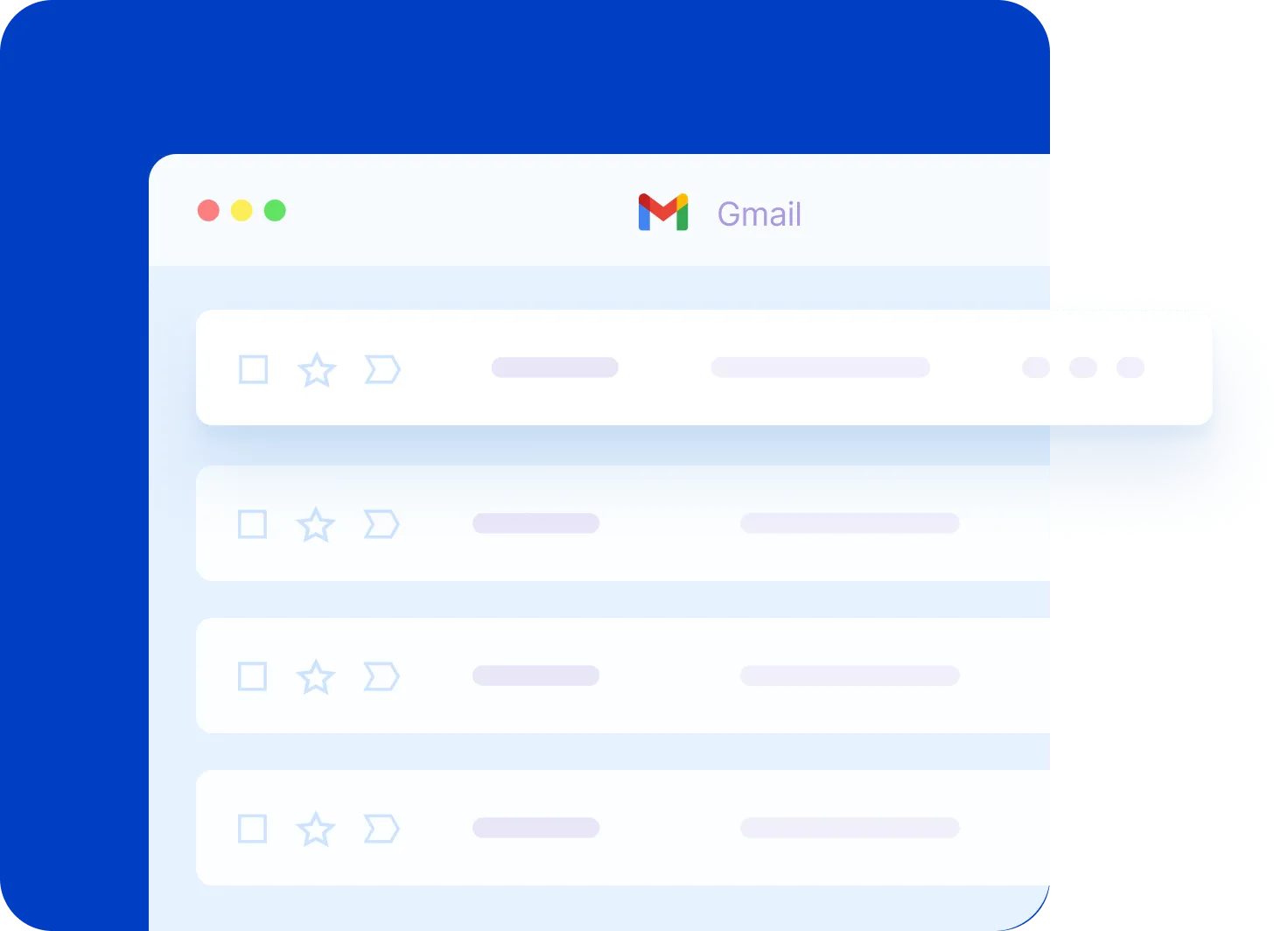
Featured Videos: Get Organized Today
Mastering Gmail: How to Add Notes & Due Dates
Unearth the secrets of Gmail to transform your email management. This video uncovers a special tip that most Google users don't know but will change the way you look at your inbox.
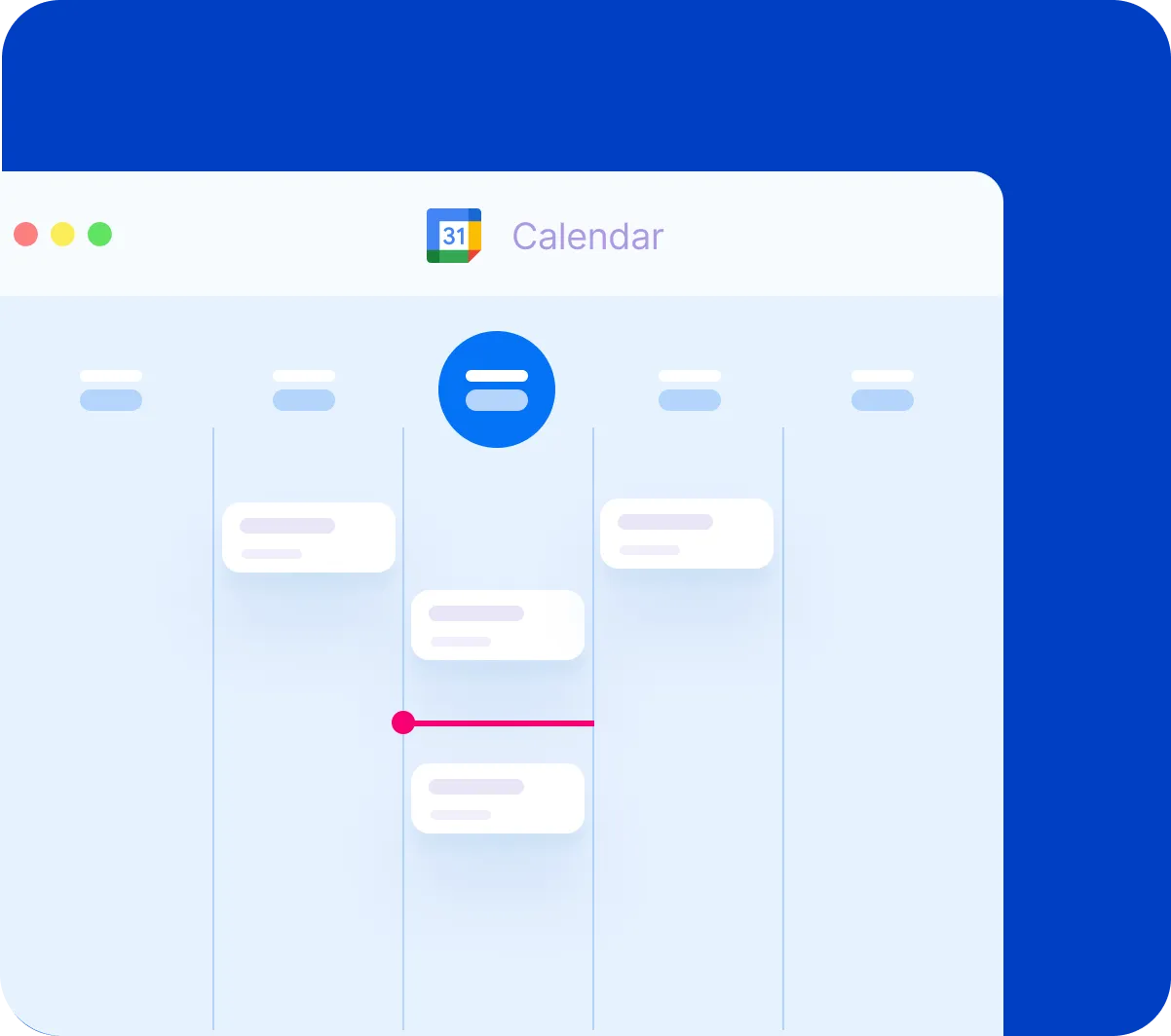
Google Calendar Essentials: Schedule Like a Pro
Are you new to Google Calendar or just need a refresher? From adding and editing events to managing multiple calendars and adjusting notifications, this video covers everything you need to know!
Google Drive for Desktop: A Step-by-Step Tutorial
Want to access your Google Drive files directly from your computer without opening your browser? In this video, I cover everything from installing the app to syncing folders and managing your files efficiently.


