


How to Create Amazing Looking Courses in PowerPoint
How iSpring works with PowerPoint
Do you want to create your own online course, or perhaps you're already very knowledgeable about online training and you're just looking for a more efficient way
to produce those courses? Well, in this video, I'm going to show you how to create a professional course within the comforts of PowerPoint, that's right. You don't have to learn an entirely new software suite, you can create things from your own PowerPoint presentations and produce them online.
Hello everyone, Scott Friesen in here at Simpletivity, helping you to get more done and enjoy less stress. And when I say professional looking courses, I mean it. I mean online training that comes with all of the bells and whistles.
We're not to talking about minor enhancements to PowerPoint,
we're talking about interactive lessons where people can take quizzes, you can upload your own additional content, and manage everything online. So let's dive in and take a closer look. Here I am working on a template as I look to produce an online course.
And you'll notice that I'm right within PowerPoint. You'll recognize the ribbon and some of the features on the top. But at the very end, you'll notice I have one additional ribbon. This is the iSpring Suite ribbon and this is going to allow me to add all of these components to any of the slides that I want.
Either, I can start from scratch, I can start from an iSpring template, or I can convert one of my existing PowerPoint slides something that I'm very familiar with and I imagine you probably are as well. So let's take a bit of a closer look at some of the features that are available to us.
Using the iSpring template library
Right off the bat, you may want to get started with some slide templates. So if we a open up this dialogue here, we're going to be presented with a number of different templates to choose from. Now, you can either view these by the different themes.
So for example, if I like the look of this sort of Olivia theme, I can expand and take a closer look at some of the templates, some of the different slides that they have available here, or I can go over here to the left-hand side of the menu and say, you know what, I'm just looking for navigation right now.
So just show me the different navigation templates that you have available. But selecting the right template,
is just the tip of the iceberg. Remember, everything within here including the text
and the images, is just a PowerPoint holder. So if you're comfortable with editing text,
moving and replacing images, just like I did here on my course objective slide, well, then you can create your course here within iSpring as well.
Adding interactions to your PowerPoint course
But let's get into some of the more interactive components. Here in the ribbon,
you can see that we have a number of different things that we can add to enhance our slides. So by opening up the interaction menu, I can select new interaction and then browse all of the different things that we can add. And this is really going to make your courses pop. So for example, whether you want to highlight a timeline,
maybe you want to label specific things on a graphic or identify a hotspot or maybe create a pyramid showing the different levels or the different structure of what you're trying to show.
So for example, just a few moments ago, I created this interaction pyramid here so that people can click on these different areas and something else will highlight. And as you go, you always have access to the preview button.
This ability to preview your course gives you the comfort of knowing how things are going to look and feel for your students. So for example, if I come down here and select on this interaction which I created, you can see as I click on different areas of the pyramid, the text that I input earlier is going to be highlighted on the left-hand side.
And maybe after going through this preview, I can say to myself, you know what,
maybe I want to change the color of this listen quadrant here. So it stands out a bit more from guide, or maybe I want to increase the text size for example, on any of these areas. This is a fantastic way to see how things are going on.
Adding quizzes and surveys to your course
Now, no online course is going to be complete without the ability to add a quiz or a survey. And what I love about iSpring, is the variety of different types of quizzes that we can add, here within the quiz maker, I'm going to select on the question type
in the top left-hand corner. And you see we can go so much further than just multiple choice or true and false. In fact, I'm amazed at how many course creators, how many course software only allow a limited number of questions.
Here you can see we can do everything from Drag and Drop to a Likert Scale, from a Select from Lists, even in a Hotspot. In fact, that's what I'm creating right here. I've uploaded this particular image. And maybe I want to quiz my course participants as to the ability to identify these different icons.
So up here, I'm going to say, please select the play icon from the image below, for example. Now what I need to do is come over here and select the hotspot shape. So I'm going to select a square in this case. All I need to do is drag it over the correct area, just like that.
And so now when the course participant is presented with this question, all they need to do is hover over and click this area to choose the correct answer. And you can even customize the responses, you can add logic branching, and add specific scoring as well.
So here I am again within the course preview. And let's say I'm going to select this icon and then hit submit. Immediately I get the response and I can customize as to what this has shown to the participant.
Let's replay this once again. I'm going to go back to that same slide, and this time I'm going to select the correct answer. I love just even how interactive this is.
We can even see this sort of ripple effect around where I've selected and I can hit submit. Yeah, this time I got it correct. I can even view my results immediately afterwards. So all of this type of functionality customizable, and I can do it right here within PowerPoint.
And here's an example of another question type that you won't often find in other course makers. So in this case, I've got multiple dropdown menus
and I've asked people to select the correct answer. So when a customer says the price is too high, you should tell them to get lost. Is that the right answer, and give them a discount coupon. How about that, let's hit submit.
Oh, one was incorrect, but the other one was correct. And just like I'm hovering over this task, it can tell me what is the correct answer.
iSpring content & character library
Now, when it comes to creating online courses, it can often be challenging coming up with enough content, enough compelling characters, or objects to include in your slides. Well, here within iSpring you have access to a complete content library.
So for example, I'm going to select this character's option here. This can really help bring your courses to life as you include pictures or example people as a part of your content. Now iSpring makes it super easy for us to filter through all of these options.
Yes, I could use the search bar here at the top and type in some specific characteristics. Otherwise, I can choose what type of clothing they're wearing, maybe I want them to be looking straight at the camera and I want them to be laughing in this case.
And immediately, I'm brought back with all of those many options. So, kind of like the way that this guy looks. I'm going to put Kevin to directly into my slide.
And the great thing is, because you'll have the exact same actor in a variety of different poses, this is a great way to use them as a profile, right? As you go through different situations. Whether that's manager and employee, or customer and sales associate, you can really get a feel of this character as you include them into your content.
Recording audio & narration for your course
Another feature which is essential for any online course, is the ability to record your own audio or narration. This is especially helpful for those of us who may not want to record ourselves on camera.
Now don't worry, iSpring allows you to record and input your own video, but sometimes recording audio is that much easier and you can overlay it or input it on any one of your slides. So after selecting record audio,
we're presented with a full screen view of that particular slide and now we have our recording dialogue. And everything is super easy to use
even if you don't have much experience when it comes to recording on your machine. So here, all I need to do is select the start record button. Hello everyone, and welcome to this course. Here are the key objectives that we'll be learning
in the following module. And now that audio is going to be attached and synced to this slide, all I need to do is select okay at this stage and I'm brought back to my PowerPoint presentation. So quick and easy, I can add it anywhere that I like
Multiple publishing options for your course
and record professional audio. Now, once you're finished editing all of your slides
and your course material, iSpring gives us a variety of different ways to publish that course. If we click here on the publish icon, we're presented with a new dialogue window which gives us a variety of different ways and places to which we can publish our course. Now by default, the My computer tab is going to be selected.
We can either publish this as an HTML 5 Course, so all of the interactive components are intact, or we can choose to produce a video course. If you want your participants to watch a video version of your course, the next two options are iSpring Space.
This is your place to publish things right on the iSpring website, or you can use iSpring Learn which is a full learning management system. Now, if you're already creating courses professionally, you may have your own LMS system either for your organization, or for the company that you are working for.
And don't worry, iSpring is completely SCORM compliant. If don't know what that means, that's okay. You probably don't need to know what that means. But SCORM gives you so many other possibilities and is usually mandatory for any LMS.
Last but not least, you can also upload directly to your YouTube account if you want to use iSpring for creating engaging education and training material online. Now, if you'd like to learn more about iSpring Suite and try it free for 30 days without a credit card, be sure to click the link in the description down below.
Remember, being productive does not need to be difficult. In fact, it's very simple.
How to Enable Dark Mode in Your Favorite Apps and Websites
Google Chrome dark mode
Would you like to make your computer screen a little easier on your eyes or perhaps you'd like to save power, especially if you are a laptop user? Well, in this video, I'm showing you how to enable Dark Mode on all of your favorite apps and websites, including productivity tools, social media sites, even your system as a whole. So let's dive in. Hello, everyone. Scott Friesen here at Simpletivity, helping you to get more done and enjoy less stress. And let's start right here within our Google Chrome browser. Now at first glance, you probably think you should come up here and come down to Settings. And then maybe on the left hand side, select Appearance and then come here to Theme. And here within the Chrome Web Store, you're going to find a variety of different Themes. Here's one called Just Black. It looks exactly what we're looking for. We want dark. We want black. Let's select that Theme. I'm going to say Add It to Chrome and it's applied. Perfect, right? We can see the black here at the top,
but oh, wait a minute. If I go to YouTube or if I go to any other website, it hasn't changed a thing. Why is that? Well, in many ways you actually don't want your web browser to try and force Dark Mode. Why? Because a lot of things are going to look funny. It's going to try its best, but it really doesn't know what every single component is. So that's why we're looking at each website and tool on an individual basis.
YouTube dark mode
Here on YouTube, for example, what you want to do is select your profile picture
in the top right hand corner, come down here to Appearance Device Theme,
and then we can choose one of these three options. Now, if we select Use Device Theme, it's going to look at your computer settings. Now, YouTube is one of the few websites that actually give this as an option. But if we want to force Dark Theme or use the true Dark Theme, we can do so here. And your experience is probably going to be very, very different. I especially notice how different thumbnails stand out much differently within that Dark Theme. But again, this might be a much easier approach for your eyes, especially later in the day if you're getting ready for rest or sleep at the end of the day.
Facebook dark mode
Let's stick with social media for a minute and jump into my Facebook account. Now, Facebook makes it fairly easy for us here. Here in the top right hand corner, we select on our account and then select on Display & Accessibility. Now here, we've got a few different options here, including a Compact Mode if you'd like to turn that on and experiment with that. But right at the top, we have our Dark Mode. So I'm going to select On. And again, it's a very different experience. In fact, what I like about this is that the content in the middle of the screen, your main feed, often stands out a little bit more and you can ignore some of the things that Facebook is going to present to you here on the right hand side.
Twitter dark mode
Let's continue with our social media and we're heading over to Twitter. Now Twitter is perhaps one of my favorites when it comes to Dark Mode and the options that it gives us. Here on the left hand side, if we select on More, immediately, in fact, it's almost perfect. If we select on More, Display is right there, but if you need to scroll down, it's near the bottom of our options. We can click on Display. Now, the reason why I like this is that Twitter gives us a few different options here, including our font size. And if we want to change from the standard Twitter blue. But down below, it actually gives us two different Dark Mode options. The first one is called Dim.
And the reason why I like this is that sometimes pure Dark Mode, where it's absolutely black, almost midnight or pure black, can be almost too extreme on our eyes. I'm just going to hit Done here for a second. And it's almost a lighter, it's not quite a blue, but it's, you know, I guess a a charcoal gray or something like that. Now, if you want to go to your pure Dark Mode, well, here we can select Lights Out and it's going to be just a little bit darker. So now we're into that pure blackness here within our Twitter account.
Google Keep dark mode
Well, let's leave social media behind and jump into our productivity apps. And I'm going to start with Google Keep, one of my favorite tools for capturing quick notes.
Now Keep makes it super easy for us to enable Dark Theme. Up here, if we select our gear icon, just below Settings, we can say Enable Dark Theme. And so, suddenly everything is going to be into that Theme. I find this is really effective when it comes to things such as checklists. And especially if you have some images that you want to stand out maybe a little bit more. You can include that here within that Dark Theme. Google Keep is a great example as to why you want to enable these changes within the app itself. So here, we can see I've got two notes. This one's shaded in a red color, this one more of a yellowish color. But if I go back to the default view and if I disable the Dark Theme, you can see it's very, very different. It didn't keep those colors
when I switched to Dark Mode because, well, that sort of defeats the point of Dark Mode. So keep that in mind as you make these adjustments along the way, how often are you spending within these apps or these particular websites? What time of day are you using these particular website or apps? This is going to help you determine what's going to be the best for you when it comes to turning on Dark Mode.
Evernote dark mode
Now, speaking of notes, if you capture a lot of notes and review your notes throughout the day, that's an awful lot of white and bright light staring back at you. So here we are within Evernote and you may already be using Evernote
or some of these other tools on your mobile device in Dark Theme, but the benefit can carry over here within your desktop browser. So here within Evernote, if we click on our profile, we're going to come down to Preferences and here again, we do have this third option to use these system settings. But if we want to go directly to Dark Mode, we can do so right here. And the links are still visible, right? The links are still standing out in this particular case, but now we can go through and access all of our notes as well.
Taskade dark mode
Now, one of my favorite productivity apps of the past two years has been Taskade. One of the reasons is that you can use Taskade and set things up in so many different ways. But Taskade also makes it very, very useful and very easy for us to switch between the two. In fact, I don't even have to go to some complicated setting or click on my profile picture. If I come down here to the bottom left hand corner,
I can just toggle Dark Mode here. I've got the moon if I want to go back to the sun. I can hit the sun, if I want to go back to the Dark Mode. So this is really super quick and easy. So maybe, for example, if I'm looking at this project in my board view, I want to see it in a different light or in a different format. But if I'm looking in this Action Mode, I want to go back to that Dark Mode. So the great thing here is I can toggle back and forth really, really quickly depending on the project. If you are new to Taskade and want to try it for yourself,
Notion dark mode
be sure to click the link in the description down below. Now, very similar to many
of the other productivity tools that we've looked at so far, Notion gives us an awful lot of white space, whether we're managing a simple database like what you see here,
or our notes, our tasks. No matter what we're doing, we're often presented with an awful lot of white. Now in Notion, it's not as easy to turn on Dark Mode. But let me show you how to do it. Up here in the left hand corner, we want to select Settings and Members. And then under my account, we want to select My Notifications and Setting. And then here in the middle of the screen, under My Settings, we have Appearance. So we can either use that system setting. You can see a bit of a Theme here. Some apps will have this option. Others will not. But if we want to go into Dark Mode, we can do so immediately. And especially when it comes to these tools where you can upload and add so many different variety of content, including links and images, and everything else,
Todoist dark mode
it's really good to use that default setting. Now rounding out our collection of productivity tools, let's dive into Todoist, which is still one of the most popular
to-do list and task managers out there. Here, we want to come up here and select our account and don't click on Settings. We actually want to click on Theme. Now Todoist gives us a variety of different Themes here. First of all, we have an auto Dark Mode, which is essentially the same as some of the options we've seen earlier where it's going to follow what your system does. More on that in just a few moments. But down below, we actually have a few different Themes, including some Pro Themes
that we can choose from. Now, here we have our pure dark or our traditional dark,
shall I say, I'm going to say Update in this case. And now our entire task list is in that Dark Theme, but don't be afraid to experiment. You may want to come back to this Theme and take a look at some of the options that are available to you here, especially like how we saw on Twitter and some of the other tools
Gmail dark mode
that we've looked at previously. Now when it comes to one application where you spend an awful lot of time day in and day out, and that is your email inbox. So let's jump into Gmail and see how we can make this a little easier on our eyes. In the top right hand corner, if we select on Settings, Gmail makes it very easy for us because there's this entire Theme section here. I'm going to select View All so we can bring up all of the Themes. Now at first glance, you may say, well, I don't really want these jelly bean skittles here. And I don't want all of these colors going on. But if you keep scrolling down, you'll see some more basic colors you can experiment with here. And the nice thing is that you don't have to go pure black or pure dark if you don't want to.
Maybe you want something like this, which is called Dusk or Mahogany. Something that's dark, but not exactly pure black. So I'm going to hit Dusk here for just a moment. It's going to change the colors of other things as well. The one thing that you'll notice is that if I open up one of my emails itself, it's still going to remain in white. So unlike most of the tools we've looked at so far, the body of the message itself is still going to have that white color. If we go and hit Reply here, for example,
we're not actually going to have that black against it. It really is the Theme
Microsoft Office dark mode
that is going to make it dark in Gmail. But of course, not everyone is a Google user.
So let's, don't forget about Microsoft. And here we are within Microsoft Office, in our Word account in particular. Now, if you're writing a lengthy article, if you're reviewing a report, for example, there's an awful lot of white going on here. Well, the good news is is that Microsoft provides us with a way to change to Dark Mode as well. So here within any Office application, here I am within Word, I'm going to select on File and then I'm going to come all the way down and select Account. Now here, I can choose
both my Office background, but also my Office Theme. So I can either choose the system setting or I can choose one of these options down below. Now, once again,
the nice thing here is that we can choose between black and dark gray. So for example, if I go to black, let's go back to our document. Maybe this is just a little too dark for me. It's got good contrast, of course, between the text and the back of the page, but maybe I want something that's not quite as dark. I'm going to go back to my account. And here, I'm going to select dark gray. and that's still going to be much easier on my eyes And you'll actually notice that the background of the page is now white. So giving you a few more options
Microsoft Windows dark mode
just to get the right balance for you. Last but not least, let's see how we can turn on Dark Mode and change our Theme for the entire Windows system. So here, if we come down to our task bar, the easiest thing for you to do is hit the Search icon.
And I suggest that you just type in Dark Mode. That's actually going to bring up
this option here, Turn on Dark Mode for Apps. So if we select that, it's going to open up our system dialogue and we've got an awful lot of choices here to pick from. Now down below, we can choose a variety of different accent colors. You may want to explore some of the other options. But here at the very top, we have three choices to make. We can either choose our mode for both Windows and our apps, or we can customize it if we want it different for each. So just to clarify what it means if we say to choose our default Windows mode, we're talking about things like the task bar, and things like the dialogue and the windows that pop up. like the border, for example, around those applications. The one below is choosing your default app mode. And that means if we choose Dark Mode here, for example, then that will carry over to things such as Microsoft Office. If we have set it to go based on the device settings. So here, I can choose the difference between the two here, but if I want to go into my Dark Mode, I can select that here. And that's going to apply it elsewhere within my system. Sometimes it may just take a second, but now we've got that Dark Mode applied over. And because in my Windows Office setting I said that I want it to carry over, now we can see that we have that Dark Mode listed here as well. Now we covered an awful lot of apps and websites in this video, but which ones did I leave out? Or which tools do you wish had a Dark Mode? Or do you have trouble finding
where to change that setting? Be sure to let me know in the comments down below. Remember, being productive does not need to be difficult. In fact, it's very simple.
7 Chrome Browser Shortcut Keys Every User Should Know!
Open Last Closed Tab
You probably spend an awful lot of time within your web browser; whether it's for work or maybe research, or maybe just entertainment, we spend an awful lot of time with our tabs and our information here within Google Chrome.
So, in this video, I want to share with you seven of the most useful keyboard shortcuts, so you can save time while using Google Chrome. Hello, everyone, Scott Friesen here at Simpletivity, helping you to get more done and enjoy less stress.
Now, most of the shortcuts that we're going to be dealing with in today's video are the same for both Windows and Mac users. Instead of Control on a Windows machine, you're going to, of course, use the Command button.
But if there are any differences, I'll do my best to highlight them. So, let's start off with keyboard shortcut number one, and that has to do with retrieving your last closed tab. How often have you been working on something and maybe accidentally closed a tab or maybe you just closed the tab a little bit earlier
and, "Oh, where did it go and how do I get back to it?" Well, all you need to do is select Control + Shift + T and that will reopen your last closed tabs.
So, this can be really useful if you either make an accident by closing something that you didn't mean to or maybe you've been working away for a little while and realize, "Oh, that would still be helpful if I did Control + Shift + T." Now the great thing is, is that you can continue to go back here.
You can see that I actually went back to another tab that was closed and I can actually continue to do so to continue to go back to other things
that I've closed in the past. So, even if you've closed two, or three, or more tabs,
you can use either Control + Shift + T on a Windows machine or Command + Shift + T on a Mac.
Close the Active Tab
Now, number two on our list has to do with the exact opposite and that has to do with closing the active tab. Now, of course, you're very used to this, going up to your tab
and finding the one that you need to. And if I'm on this particular page, if I come up here and click on this little X, but often depending on your screen size, this little X can be really small that wastes an awful lot of time. Well, instead of finding my cursor
and having to bring it all the way up here, all I need to do is select Control + W and that will close the active tab, whatever you're viewing at that particular time. So, if I'm on this hotels.com site, and I say, Control + W, that's instantly going to close that tab.
I don't have to use my mouse, I don't have to come up here and find that little X, and again, if I want to retrieve it, hey, let's go back to tip number one and I can bring it right back to me.
Jump Between Next and Previous Tabs
Next up on our list, we have a shortcut key, which is going to help us save time when we are moving through our different tabs. Sometimes, you may be giving a presentation, or maybe you just need to go back and forth between a few tabs. So, instead of using our cursor and always having to bring it up to the top of the screen,
especially if we're doing something down here below, instead, we can hit Control + Page Up or Control + Page Down. If I select Control + Page Down, it's going to move it to the right. If I select Control + Page Up, it's going to move it to the left.
So, I can either quickly cycle through a number of my tabs or I can go back and forth depending on the direction that I want to go. Now, if you're a Mac user, it's going to be slightly different. You're going to select Command + Option plus your right or left arrows, depending on the direction that you want to go.
One of the ways in which I make use
of this keyboard shortcut is whenever I'm sharing something on Zoom or video conferencing. So, for example, rather than having participants always see my cursor, right? Always see it come up here and showing the different tabs, all I need to do is use those keys and I can go back and forth between maybe two or three particular websites that I've set up in advance.
So, maybe I want to show them a map, then I want to quickly show them a video, and then I want to show them something else
and go back and toggle between a few different pages. It allows me to free myself up from using the mouse. And also, my viewers don't have to see my cursor on the screen at all times.
Open the Downloads Page
Next up, we have a shortcut key which is going to help us manage our downloads that much quicker and easier. Now, when you're browsing around and downloading things, whether that may be a file, or a PDF, or maybe a picture, as in this example,
you're probably used to seeing the Menu at the bottom of the screen. So for example, here, I'm going to save this image as, and I'm going to say, "Yeah, we can save it there." I'm going to hit Save. At the bottom of my screen here, you can see that image. The browser is telling me that I've just downloaded this particular image.
And sometimes, this can clog up or you'll see multiple things here unless you hit the X and close that window. But what if you want to go back and review what you've downloaded or maybe make sure that you're not downloading the same thing multiple times? Well, all you need to do is select Control + J for windows users
or Command + Option + L and it will bring you directly to the Downloads Manager screen. So, here I can see a full history of all of the things that I've downloaded on this particular machine. I can also see it by date as well.
Now, the nice thing here is that I can either click on that image immediately and it's going to open it up so I can access it here on my machine. It also gives me the option to show it in my folder on my computer, which can be convenient if I'm saving things in the same location and I want to review those items as well.
But the other nice thing about the Downloads screen is that it is searchable. So, for example, maybe I just want to search for JPEG images. Maybe I'm just looking for things that are images.
So, I'm going to use that file extension to search for things or maybe if I was searching for that sunset, for example, I'm going to use that keyword sun, and I'm going to find that image here as well.
So, if you want to quickly come to your Downloads screen right here within the Chrome browser, Control + J or Command + Option + L for Mac users.
Open Bookmarks Manager
Next up, let's take a look at how we can access and manage our bookmarks that much faster and easier. Now, you may be familiar with accessing your bookmarks here at the top of the Google Chrome browser.
In order to do so, all we need to do is use another shortcut key, which is Control+ Shift + B. By either selecting this, we can toggle this on or off, but the one I want us to focus on is the one below, and that is accessing our Bookmark manager, Control + Shift + O. So, here, I'm going to do Control + Shift + O and in a new tab, it's not only going to bring up all of my bookmarks, but just like how we saw on the Downloads screen, I can search through these bookmarks.
I can also reorder them and maybe manage my bookmarks that much easier here. Sometimes, it can be difficult to do all of this here within our Bookmarks bar and especially if you have a large quantity of bookmarks, this might make it that much easier.
Now, if you're a Mac user, you're going to want to select Command + Option + B to open up your Bookmarks Manager. So, it is slightly different from both operating systems. For example, if I have a very large quantity of bookmarks and a combination of folders,
I can use the Search to search for something in particular. And I can find my social folder here and maybe it's a bit easier for me to drag and drop. If I want to bring Twitter to the top of that menu, I can do so here as well.
We also have access to all of our other options here, too. Sometimes, it can just be faster to go to this Bookmarks menu first and then open it up in a new tab or copy the URL depending on what you're wanting to do with your Bookmarks Manager. So, don't forget.
Control + Shift + O for Windows or Command + Option + B for Mac users.
Launch Incognito Mode
Now, the next keyboard shortcut on our list is going to allow us to browse privately
so that no one will see a history of what we're looking at or what we're doing online.
And, yes, we're talking about Incognito mode. Now, you may think that Incognito mode is primarily just to hide your activity and what you're doing, but I'm actually going to show you how I use incognito mode more often, especially when it comes to my business and things that I'm editing online.
Now, you may be used to coming up here to the menu and selecting New Incognito window, but this shortcut is going to get us there that much faster. And for that, we want to select Control + Shift + N and that's going to immediately open up a new Incognito window or an Incognito browser.
Now, just a few things to clarify, yes, you can browse privately and Chrome will not save your history, your cookies, or site data, or any of the information that you've entered in on your forms. However, you should note that your activity might still be visible to the websites you visit, your employer or school on where you are accessing, and your internet service provider.
So, no, you're not the only one in the world that's going to keep all of this information private. Some of your activity may be visible to some of these people or organizations.
I actually use this to test a number of my websites or to test some of the things that I've been doing to see how my users will actually see it on their end. So, for example, I'm going to type in simpletivity.com/reset, which is one of the courses that I teach throughout the year.
Now, I make a lot of changes to this website, depending if enrollment is open or not and when I'm on the editing side, sometimes I'll see other things where it won't behave the exact same way because I already have an account, for example, or I can already sign in, or I have an email address that's already a part of the waitlist.
So, I will often use Incognito mode to test my website or to test some other services just to make sure and I can see how things are going to behave for individuals who are actually visiting my site, how it's going to look and feel for you, for example.
So, the next time you need to test something out, you want to make sure, "Hey, is this how I'm experiencing it because I have an account or I'm the administrator?" All you need to do is select Control + Shift + N or Command + Shift + N to go directly to Incognito mode.
Clear Browsing Data
Last, but certainly not least, let's take a look at how we can quickly clear our browsing data or clear our cache, depending on what we need to do or if we're trying to wipe away some of our history here.
Sometimes you've been using a site and maybe you've been talking with a support team. And one of the first things that they suggest is to clear your cache or your browsing history to fix a problem that you may be experiencing.
Well, you could come up here to the Settings and then come down to More tools, and then come down to Clear browsing data, and eventually get to where you need to be. But there is a much, much quicker way. All we need to do is select Control + Shift + Delete on our keyboard and we are going to be brought directly
to the Clear Browsing Data menu. Now, this is something that you may want to do on your own on a semi-regular basis, whether that's monthly or whether that's quarterly,
not only can you clear up some room, for example, here, I can free up a little over 300 megabytes, but it can also remove some of the cookies and site data that you've collected along the way.
And of course, at the top, you can choose in terms of the timeframe that you want just the last hour or day or everything from the beginning of time. So, rather than coming up here to the menu, make sure to select that keyboard shortcut Control + Shift + Delete. Now, I would love to hear from you next.
What are some of your favorite keyboard shortcuts or how do you get the most out of the Google Chrome browser? Be sure to let me know in the comments down below.
Remember, being productive does not need to be difficult. In fact, it's very simple.
How to use Trello Labels - Beginner to Advanced Tutorial
How to add and edit Trello labels
This video is brought to you by Rewind Backups for Trello, the top rated recovery app for Trello. Backups for Trello should really be the first power up you add to your Trello account.
Why? Because it will protect your boards from human error, buggy extensions and collaborators who might not know what they're doing. You can think of it as an undo button for Trello. To learn more and unlock your special offer, head to rewind.com/scott-friesen.
In order for you to get the most out of your Trello boards, you need to be using labels so in this video we're going to start with the basics and work our way up to some more advanced techniques so you can get the most out of Trello labels.
Now when you first create a Trello board, you're not going to have any labels applied. So let's start off by finding out where we go to both edit and access our labels. First off, we can go to show menu and then select more and then the second option is going to be, you guessed it, labels.
And here we can see all of the labels that are available to us. Now again, on a fresh Trello board, we're not going to have any titles listed here, but let's go ahead and start adding some so we can get started.
So to the right of each of these colors, you will see a little stylus and if I select this, I can now give this green label a name. So maybe I'm going to call this HR in terms of human resources. I'm going to then hit save.
Now I've got that title associated with this particular label. Let's give another label a name here. This time I'm going to select yellow. So I'm going to give this one maybe a priority level so maybe I want yellow to mean medium priority in this case so I can enter that here into the text field.
If I want to change the color, I can do so here as well, but I'm going to save it as just this yellow in this particular case. Now you're not limited to just the six different colors that we see here, nor are you required to add a title.
Maybe I just want to use red to distinguish some of my cards from others. I don't necessarily have to give it a title, but the nice thing is is that we can search our labels if we do give them a title.
And if we do need to add more labels, we can just come down here and select create a new label
Viewing labels within a card
and then we can add some additional colors as well. But of course, this is not the only place that we can go in order to access our labels. We can open up any of our Trello cards and here in the top right-hand corner, we have the labels button.
So if I select this, we are basically presented with the exact same menu. Now in this case, I can also use this to apply my label. So if I want to add the HR label to this card, I can then select it and now you can see it's going to appear here.
Now when there is at least a minimum of one label applied to a card, you will see this plus button right next to that label. So here I can select the plus button instead of using the label button and now I can access my other labels here as well.
And if I want to remove any of these labels that have been applied, I can just click on them and it will also bring up this menu where I can make adjustments. And keep in mind, you can add as many labels to a card as you like.
Quick ways to access Trello labels
But let's stick with accessing our labels and I want to show you maybe the easiest way to bring up the label menu and that is when you are hovering over a particular card. Let's say that this card here, hire a new HR assistant, that certainly sounds like an HR activity.
So I want to be able to quickly and easily bring up my labels menu.
What I could do is select this stylus in the top right-hand corner and this will open up sort of a mini menu here where I can select edit labels. And yes, I can add the HR label and hit save. That was rather quick and I didn't have to open up the entire card,
but let me go over here and just remove that for a second and I'm going to show you an even simpler way.
Here all I have to do is hover over that card and then select L on my keyboard. Yes, L for label and that will immediately bring up my label menu
so now I can access that HR label and apply it directly here. If I want to go over here and add a label to review these docs, I can again hit L on my keyboard. That will immediately bring up my labels and now I can apply whichever labels that I like.
Now once you start to become more familiar with your labels, there's an even easier way for you to quickly add and access your labels on each of your cards. Let me open up the labels menu here just for a second so you can see our labels in order.
You'll notice that we have green, yellow, orange, red, purple and blue and this is the default order of your label colors for any new Trello board. But this order can be helpful because the keys on your keyboard, the numeric keys, also correspond to these colors.
So for example, green is one, yellow is two, orange is three and so on.
So if I want to quickly and easily add that HR label to this card as well, all I have to do
is select the number one on my keyboard and it is added. If I want to remove this green label, I can just select one again and it will be removed. Maybe I want to add the first three labels to this card.
All I have to do is select one, two and three on my keyboard and they are immediately all applied. So you may want to get to know these quick keys, at least the most common labels and what numbers they are associated with.
As long as you are hovered over them, you can add or remove them just by using those numeric keys.
Expanding Trello labels
Last but not least, what can be very helpful when dealing with labels is actually seeing the labels on the top of the card. Now by default, we are limited to just these color strips as you see here.
But what if you forget what this green label actually means? Instead of having to open up the card and saying, oh, that's right, green means HR and yellow means medium, there's a much easier way.
Here within our board view, all we need to do is actually click directly on any of our labels and it will expand them for the entire board. Now we can see medium and HR and if we end up giving this orange label a name, we'll see it here on the front of the card.
So this may be a much easier way for you to deal with your Trello boards and actually see those labels. Now don't worry if you or a member of your team ever make a mistake and apply the wrong labels to a bunch of Trello cards and you don't have the time to manually remove them, you can use Rewind Backups to quickly restore your board.
To learn more and to receive your special bonus, click the link in the description below.
Color blind friendly labels
So you will also see at the very bottom of our labels menu, we have the ability to enable color blind friendly mode. So if you would like to distinguish your labels that much more, you can select this option.
Here you can see that the colors remain, but there are some additional shapes or patterns which are added to the labels to help give them a bit more distinction, especially for those who may experience color blindness.
Trello label examples and use cases
Now that you know how to create, edit and add and remove labels to your cards,
let's take a look at a few useful examples. So in this case, I'm going to go back to our labels menu here and I'm going to make a few changes. The first thing I want to do is create some urgency or a priority level for my label.
So for example, maybe the red label I want to be a high priority so I'm going to type in the word high and I'm going to hit save.
Orange perhaps I'm going to change and I'm going to make that one the medium priority and then the yellow I'm going to edit and make it a low priority so I'm going to use this to distinguish, you know, what's important and what is less important on my particular boards.
I can keep HR as green here, but maybe I'm going to come down to my purple label and I'm going to label this as sales, for example. And maybe the blue, I'm going to say is part of my support team and I'm going to hit save there.
So now I've got a combination of both departments, but also urgency as well. So let's go back to some of my examples here. I can't have something that is both medium and low priority so let me open up my labels menu here and I'm going to say that this is actually a medium priority.
Over here I'm going to say that this is a high priority and it's part of the support team. I'm going to say that this is also a high priority. This time it's part of the sales team and let's maybe do one more here.
This isn't assigned to a department. I'm going to say that this is assigned to the sales team as well. So now you can see we have a mix of labels,
both priorities, but also the departments in which they are assigned to or which they are attributed to. Why is this helpful?
Filter cards by labels
Well, here in the top right-hand corner, we have the option to filter our cards. And labels is one of the best ways in which we can filter the information on any Trello board. So here I'm going to select filter and about halfway down, you can see that we have this labels option down below.
So for example, maybe I just want to quickly and easily see all of the cards which are assigned to HR. I'm going to check this checkbox
and it's only going to bring back those two cards. Now in today's example, we only have about a dozen cards in which we are dealing with, but you very well may be dealing with a board that has hundreds of different cards with many, many different labels.
So this can be a great way for us to filter out that information. Next up, maybe I want to add another label to match my filter so maybe I don't only want to see things
that are matching HR, but I want to see everything that HR has that is also a medium priority so I can select this option here as well. Now you may notice that this one did not go away.
That's because at the bottom of our filter menu, we have the choice to use either any match which is what we have set right now so anything that has HR or a medium priority. But if I come down here and select exact match, now you can see we only have the one card which matches both HR and medium.
So make sure that you take a look at this last option, depending on what you are looking for. Whenever you want to be able to clear a filter, all you need to do is come up here and select this X and you'll go back to your normal state or your primary view of your Trello board.
Trello card covers
Now in addition to labels, there is another way in which we can help distinguish
certain cards on our boards and that has to do with applying a cover. When you open up any card within Trello, on the right-hand side you will notice that there is a cover button. By selecting this option we see many of the same colors that we saw within our labels menu, but a card cover acts and behaves a little bit differently,
but may be suitable for your needs. Now here in the top, it's going to show us
how that cover is going to look. Either we can have a single strip of color at the top of the card or we can make the entire card the color that we choose down below. So let's go with something a little bold and I'm going to select this red.
Now by default, it's going to choose this red color here. Now when the card is open, you're going to see it at the top. But if I go back to my board view. Here you can see that that red spans the entire length of the top of that card.
So no matter where I move this particular card, it's really going to stand out. Let's keep with this particular card
and now that we've applied a cover, you will notice that that cover is no longer available to us here in the add to card section. We actually have to come up to the top and select cover.
By doing so, we can choose the second option which is going to make the entire card red. Now it's not going to make any difference here when we are viewing the inside contents of the Trello card, but when we close it, now you can see that entire card is now red and even the text is a little bit larger and bolder.
This is ideal if you want to create a section break or maybe create a header at the top of your Trello lists. The downside is it will not show other card details on the front such as a due date or a member assignment or other things as you see here.
But again, if you'd like to use this as a header or as a section break, this can be a great idea. Now if you want to remove your cover, all we need to do is come back over here and here we can say remove cover and we will go back to the default.
In addition to just adding a color cover, you can also upload your very own cover image or maybe search for an image online. So in this case, if I really want to spruce things up, I can have this cover image on the front of my card. So a lot of flexibility, an additional way
in which you can segment and highlight certain cards on your boards.
Secret hidden labels
Lastly, let's take a look at a secret or special label that even some of the most advanced Trello users do not know exist. In some cases you may want to apply a label that does not necessarily show up on the front of your cards here, but you may still want to be able to filter or search for that label.
So let's open up our labels menu here in this particular example. Here at the very bottom, I'm going to select create a new label. And what you may notice is the very last option we have available to us is this gray label and it has no color, meaning that it won't show up on the front of our cards.
So in this case, I'm going to call this one a special label and I'm going to say create. Here you can see I've actually applied this special label to this particular card,
but you will notice that that label does not show up on the front of the card. If I open it up, you can see that yes indeed, that label has been applied and I can go over here and I can apply that label to other cards as well, but they will not show up on the front of my card.
So if you want to segment out your cards or maybe tag your cards without having them interfere with your other existing labels, you may want to apply the special and secret gray label.
This video was made possible by my friends at Rewind, the number one backup and recovery solution for Trello. Listen, mistakes happen, but you can recover from small errors all the way to major catastrophes in no time with Backups for Trello.
Feel confident working in Trello independently or with a large team.
For more information about protecting your boards and to unlock your special offer, head to rewind.com/scott-friesen.
This FREE Meeting App Makes Zoom Look Boring! (Butter)
Interactive meeting options
Have your video meetings become a little boring? Have you found it increasingly difficult to engage your participants when you have a video conference or hosting a webinar online? Well, in this video, I'm going to show you how Butter can make your next video meeting that much more exciting and also easier for you to host.
Hello everyone, Scott Friesen here at Simpletivity helping you to get more done and enjoy less stress. And today, I've got my friend, Rex, joining me for this video demonstration
so I can show you all the ins and outs of Butter and why this is going to make Zoom meetings and Microsoft Team meetings and most other video conferencing meetings look boring in comparison. So right off the bat, I love the simplicity of Butter.
Here on the left-hand side, we have our interactive options where we can decide if we want to mute ourselves, unmute ourselves and also react to things as well and you'll notice right away that things are big and bold.
So if my participants want to react to something, if they want to give a shout out or a hand of applause, it's big, it's bold, things are moving around. And as a host, I can even go one step further and add some sounds.
If I want to (cheering) give someone a round of applause, because I thought their comment was fantastic, I can do so at a click of a button
or by using a shortcut key here on my keyboard. Now on the left-hand side,
Built-in agenda
we have our interactive options. And then on the right hand side, I've got some additional tools available to me as a host.
And that's really where I want to start, because this is where I think Butter sets itself apart from so many other video conferencing tools. Right off the bat, we can create an agenda in advance so that not only can I stay on track, but everyone who's joining me for this meeting can see this agenda as well.
And as I'm adding the agenda, it's going to do the math for me. So I can see the total length of this particular meeting. Of course I can adjust this on the fly if I want to, but I always have access to the agenda here.
If I want people to see the agenda and resume the agenda with me in real time, all I need to do is click this button here at the top. And here you can see it's actually starting a timer, which is great to help us stay on track.
How often have you been involved in a meeting, number one, there's no agenda or the agenda is buried in the calendar invitation, and then number two, we spend way too much time on a particular topic? This has the timer built right into the agenda items.
Of course I can adjust things. I can choose to see the full agenda here to see
if we're on track or if we need to move on to something else. But these are great productivity enhancements to make the meeting so much more enjoyable, but also so much more effective.
Timers for smooth meetings
Now, if we just want to use a timer, we can do so as well. Here's a timer feature and I've set up one called, "Let's start to wrap this up." You can create as many custom timers as you want, or just start a quick start timer whenever you like.
So in this case, maybe when there's about five minutes left in the meeting, I'm going to start this timer on my end and down at the bottom of the screen, everyone is going to see this timer.
So they know "I mean business" or "Listen, we should really wrap this up so that we can get on to our next meeting or our other commitments as a part of the day."
So I love these little enhancements that can make our meetings that much more effective and help us to stay on time.
Polls that are worth sharing
You'll also notice below the timer function. We have the ability to create polls. Now we can, of course, create as many polls as we want in advance, but we can also create new polls on the fly.
So in this case, I've decided to add this question, "Which app should we integrate with next?" And I'm going to say, see the results so I can show this on screen. I can see who voted for what and who the overall winner was as well.
So again, if I want to export this data, if I want to reuse this poll multiple times in the future, I can do so as well, all at my fingertips here. Now below polls, you'll see that we have a breakout rooms feature as well, but I'm going to come back to that in just a minute.
Back over on the left-hand side, I've already given you a sample of some of the reactions and sounds in which we can include and enhance our meetings.
Better comment & question management
But one feature that I really love here is called the queue. How often have you been trying to manage questions and comments and other things that are coming at you through the chat window? But what if someone does have a specific comment or a question.
Those are two very different things and you want to actually hand over the microphone to them. Well, that's where the queue comes into place. Where people can decide, do they have just a comment or maybe an idea, or do they have a specific question? So in this case, I'm going to say that I have a comment.
And what you'll see in the top right-hand corner is that there is a queue building up. A queue for the host to manage and to see who has a question. I can see that Rex has a question and I can see that Scott has a comment.
What I can do now is I can hand over the microphone to Rex. People can see that Rex has the floor, so to speak, and he can ask his question. Then at my control, I can hit X, remove him from the queue and then answer that question or maybe start a discussion.
So this is a great way to manage those questions and or those comments in a queue style format and separate from the chat. Of course, Butter is going to have a chat window here.
So if you prefer text management, or if you prefer to have your participants be able to communicate with one another, they can do so here in the chat as well. But this idea of a queue I think is fantastic.
Add private notes
Speaking of ad-ons that really make Butter shine and stand out from the competition, you have an opportunity to collect and record your own personal notes.
And no, I'm not just talking about the facilitator, I'm talking about participants as well.
So each user has access to this private note space, and you can even do some basic formatting, such as bolding or creating bullet points in real time. And the great thing about my notes, here are some notes for example.
Let me just type in a few things here, is that they don't go away. Even if I close this dialogue. So let's say I'm taking some notes here, but then I want to get back to the discussion, or I want to listen in on what others are saying.
All I need to do is hit that notes tab and my notes remain here. So I can collect notes along the way. Then I can export those notes and save them for use later. A great tool to, again, keep your participants engaged, giving them the opportunity to take notes without having to switch tabs or to open up another application on their computer.
Host & facilitator tools
But let's go into some of the other facilitator tools that we have available to us, just to show how easy it is to set up your own Butter sessions. So here I am within my Butter dashboard and you can see I've already created two different rooms.
I've got my Team Brainstorming Meeting, which we were just in. I also have a, another one called an awesome Workshop. What I really appreciate about Butter is that I don't have
to create a new meeting each and every time. I can create as many rooms as I want
and repurpose them for very specific purposes. It also gives me an opportunity to prepare materials in advance so I don't have to be sharing my screen, sharing other documents or preloading other websites. Let me show you what I mean.
If I hit set up here for my Awesome Workshop, you can see I've already created a few defaults here. I've created a color scheme. This is actually going to be the intro screen here
on the right-hand side. I can choose things like background color. I can even include some elevator music. (calming music) So when people are first joining the meeting,
maybe testing out their camera and microphone or entering in their name.
Again, something to liven things up a little bit, make them get excited about joining my video conferencing. But on the left-hand side is where we have some of those features that we saw in meeting. And I want to show you just how easy it is to create and set this up.
How to create an agenda
So here under agenda, I can say, well, let's start off with some introductions, for example, and maybe we're going to do that for about 10 minutes. I'm going to hit save. And then we're going to review the last meeting minutes or something along those lines.
That should only take us about five minutes in length. I'm going to hit save here. You can see it's summing up the length of my meeting so I can see exactly how long each section is going to take.
And as you saw in my previous example, everyone can have access to this and to see that agenda in the meeting, not having to go back and reference another document.
How to setup timers in advance
Here under timers, I can create my customized timers. So maybe I want to say that this is going to be our twenty-five minutes for a particular game or an activity.
I can set the time, give it a specific color, even give it some specific music if I want. Polls or another great feature in which we can repurpose across our meeting rooms. But if you really want to get your participants engaged,
Breakout rooms that are easy to use
I encourage you to use the breakout feature. Here you can see I've created a breakout room in advance. In fact, I've created three distinct breakout rooms.
I've added a few specific tools. I've even set a time limit. If you are hosting a webinar,
if you are running a class or doing any type of teaching,
Butter breakouts are the choice for you. In this breakout rooms example, I've created three different rooms and I've given them each a specific title, Watch and Learn; Win, Lose, or Draw; and Mind Map Mania.
I don't know how many times people have asked me, "Scott, I'd like to set up something in advance in Zoom, where there's an activity or something waiting for my participants and then I can just cycle them through those different rooms." Well, that's exactly what Butter allows you to do here within their breakout feature.
So for example, in Watch and Learn, I have already uploaded a particular YouTube video. No, I don't have to share my screen. I don't have to just give them a link and hope that they all watch it on their own.
The video is going to be waiting for them in that breakout room. In the Win, Lose, or Draw room, I've already uploaded and set up the whiteboard here within Butter so that they can just start playing the game immediately.
They don't have to hold up a piece of paper from their desk or do something else or have someone know how to initiate the whiteboard. The whiteboard is going to be waiting for them there.
And here in the Mind Map Mania, maybe I've got something else prepared. If I click on the tool section down below, you can see the direct integrations that are available to us right here.
And it's just as simple as dragging them into the tool section. Now I have that whiteboard waiting for me and waiting for my participants in the breakout rooms. But let's go see how this looks like for the host because it gets even better
Managing breakout rooms like a pro
with how we manage those breakout rooms. So here I am back in my Butter session
and on the right-hand side, I'm going to open up my breakout rooms here. I'm going to select start now, or if I need to make any adjustments, I can do so on the fly. I'm going to select start now here. And I'm going to say, "Yes, I want to assign these participants in advance." So I've got my participants here on the left-hand side.
I could assign them randomly, but maybe I want to make sure that Rex starts in the Watch and Learn. And I'm going to maybe start myself in the Win, Lose, or Draw room,
just cause I want to give them some additional instructions. I'm going to select start breakout at this point. And those breakout rooms are going to be launched. I'm going to say yes, bring me there right away.
And now I can start with this whiteboard. Remember I said that whiteboard should be waiting for me. Here it is. I don't have to launch anything. I don't have to share my screen. I can do so right here. But as a facilitator to the meeting, it gets better. If I come up here to the top of the screen,
I can see all of the breakout rooms and join any of them at a click. But maybe let's start out by just taking a look at the breakout overview screen. So if you're managing several breakout rooms, you can see exactly who is in which room, what's going on,
and you can choose to observe that room without having to join the room. Something that is lacking in Zoom meetings, for example, is that you actually have to join that room and everyone in that room knows that you're there.
But if you're the facilitator, you can somewhat just eavesdrop just like a teacher would in a real classroom and just see how things are going. You can choose to join the room later if you want to, but you don't have to show your presence at any time.
So this really makes the teaching and the facilitation of these rooms so much easier. You'll also notice that there is a timer at the top of the screen. Why? Because when I was setting up my breakout rooms, I decided that I wanted to spend 10 minutes in each room
and then I want everyone to switch or move to the next room. Others will have access and be able to see this timer as well. So they can know when to wrap things up and then we can move to that next breakout room.
So again, very thoughtful features here for both facilitators and for participants to make these workshops, to make these trainings and these conferences that much more engaging and effective.
Easiest way to share video in a meeting
And one more thing. How often have you tried to share a video in your online meetings only to forget that you have to both share your screen and oh, you have to hit that checkbox to share your sound as well. Butter makes it so much easier because we have a direct integration to YouTube.
So you can preload all of your YouTube videos. If I click on this video here,] it's immediately shared right here within my Butter interface. So I can hit play, no more stumbling around or asking people if they can hear the video.
So if you're tired of boring video conferences and would rather spruce up your meetings, (dramatic music) be sure to check out Butter. See the link in the description below for more details. If you have any further questions about Butter and its video conferencing features, be sure to let me know in the comments down below.
Remember being productive does not need to be difficult. In fact, it's very simple.
Best Productivity Apps of the Year! (Awards Show)
Welcome to the Awards Show
Ladies and gentlemen, boys and girls, productivity enthusiasts from around the world, welcome to the 2021 Simpletivity Subscribers Choice Awards. My name is Scott Friesen, helping you to get more done and enjoy less stress, and I'm excited to dive into this year's award show, so let's don't waste any time. We have six different categories, ranging from the best browser extensions to project management apps,
to the coveted best to-do list app of the year and many others in between, all selected by you, both the nominations for these different categories, but also, you had an opportunity to vote for your favorites. So yes, this is very much like a People's Choice Awards. None of these are necessarily my favorites or necessarily my personal picks. I wanted to leave it up to you. So let's dive in to category number one,
Favorite Browser Extension
which is your favorite browser extension. Now, this is a difficult one, because there are so many different browser extensions, and many of the extensions that are nominated are based on what you're already using, the tools and the apps that you're already using. But let's take a look at the nominees. The nominees for best browser extension are Bitwarden, Pocket, and Todoist, and the winner of best browser extension for 2021 is Bitwarden. Now, this was a bit of a surprise to me. For those of you who are not familiar with Bitwarden, it is a password security app very similar to things such as LastPass or 1Password, but many of you spoke in droves, saying how much you enjoyed the usability,
the ease of use, of installing, and making use of Bitwarden. Now, as it comes to all of these categories, what I would encourage you to do is take note of the apps that you were unaware of, and maybe try them out for yourself, or at least do a little bit of research. Although this is very much a popularity award show, I think it's very important to listen to what other people are using, what other people are installing,
and seeing if you can't find something that is maybe better suited for you in the coming year.
Favorite Video Conferencing App
Let's jump into category number two, and our second category has to do with our favorite video conferencing app. Of course, in 2020, video conferencing absolutely exploded because of the pandemic. By 2021, it became the norm for many of us to meet with others using video conferencing technology.
Let's take a look at the nominees. Your nominees for best video conferencing app are Google Meet, Teams, and Zoom. This year’s race was much tighter than last year’s, but your winner for favorite video conferencing app is Zoom. Yes, Zoom retains its title as the most popular—or your favorite—video conferencing tool.
I want to take just a very brief pause here and let you know about something coming up in 2022, one of my favorite ways to kick off a new year. I am running the Reset Productivity Masterclass to help you get the most out of your technology, simplify your workday, and learn techniques to maximize your use of some of the apps we're discussing today. It’s a live, four-week class.
The Reset Productivity Masterclass is where I teach you and a small group cohort in a live webinar environment. You get to interact with me, ask me questions directly, and I give you small homework assignments along the way so that you can change the way you work, feel more in control of what you do day in and day out, and get the most out of your software and apps. If you'd like to learn more and enroll in the January cohort, be sure to click the link in the description below or go to simpletivity.com/reset.
Okay, let's jump into our third category for our award show.
Favorite Cloud Storage Service
this evening, this afternoon, or this morning, depending on where you are, and the category is cloud storage. Now, again there's going to be some biases here, depending on what other tools that you're using. If you're an Outlook user versus a Gmail or a Google Workspace user, you know, this might be foretold in terms of what you're using day in and day out, but if you had the choice, what was your favorite?
Let's take a look at our nominees. The nominees for favorite cloud storage app are Dropbox, Google Drive, OneDrive. Well, the winner here, not a terrible surprise, especially since I talk so much about Google tools and Google apps, but your favorite cloud storage app was Google Drive, a very flexible tool, which, again, allows us to not only create and store a variety of different files and share them with others, of course, but if you're already using that Google infrastructure, might be the best selection for you. Well, we've now come to our top three, maybe the most coveted awards of this show, best project management, best note taking app, and best to-do list app.
Favorite Project Management App
And let's kick things off with best project management app. The nominees are Notion, Todoist, and Trello. Now, this was one of the tightest races this year. In fact, historically, this has been one of the tightest races when it comes to the Subscribers Choice Awards. Your winner for favorite project management app is Notion, Notion, by a little bit of a hair, maybe a few hairs, beyond Trello. Now, I think this speaks to just how diverse Notion is, just the multiple and various ways in which you can set up your Notion workspace, and whether you like a Kanban style of managing your project management, whether you want to create a simple database, whether you want to use it for note-taking and brainstorming, you can just do so much in Notion,
whereas Trello, who was a close runner up, again, is going to keep you in that Kanban style of project management. Now, a quick note here, and the final nominee in this category, Todoist, I saw many comments saying that Todoist really isn't a project management app, but I would have to argue against that, that initially, Todoist was very much a to-do list app, a task manager. However, over the years, they have added much greater project management capability, collaboration capability,and it can be a very effective project management tool. So I think it was right to choose this, or to add this into the nominees list. You're the ones who put it there in terms of one of this top three categories, but there you have it, Notion, Todoist, and Trello the nominees, and Notion taking the win.
Favorite Note Taking App
Moving on to best note taking app in 2021, and of course, note taking apps are so vital to make sure that we keep and capture all of those ideas, those aha moments, all those things that we could be doing, should be doing, maybe we want to put on the back burner for a little while, having a tool ready so that we can both input information, but also grab that information at a later day. Your nominees for favorite note taking app are Google Keep, Notion, and Microsoft OneNote. Now, the winner for favorite note taking app is Google Keep. And again, not a huge surprise here, as well, but I think this speaks to the simplicity of Google Keep, its ease of use, how fast Google Keep is, not only just in the desktop or browser version, but especially when you're using it on your mobile device. You're probably taking your notes, grabbing your notes, and maybe also retrieving your notes on your phone, more than anywhere else, or maybe on a tablet or an iPad, and that's where speed really, really counts. You don't want to wait just a few seconds for that app to load, and then find the place or add a tag. Google Keep does an extremely good job of, yes, it doesn't have all the bells and whistles, but it gets you to where you want to be. So your choice for favorite note taking app this year is Google Keep.
Favorite To-Do List App
Last but not least, we've come to the final category in our award show, and that is the coveted favorite to-do list app of the year. Of course, this is vital for being at your productive best and for getting the most out of your workday. Your nominees for favorite to-do list app are Google Tasks, Microsoft To Do, and Todoist.
Now, an interesting collection here. It’s not a surprise that we have a Google app in our top three. Microsoft To Do makes its first appearance in many of these different categories, showing just how important Outlook and Microsoft remain. They’ve done exceptionally well with the Microsoft To Do app, really gaining a loyal following over the last few years. And then, last but not least, we have Todoist, which is often the front-runner. I would say, you know, when people ask me to recommend the best all-around to-do list app, it's hard not to go with Todoist because of all the features and functionality it offers.
But this isn't about my personal selection, and it’s not about my preferences; it’s about what you selected. So the winner for favorite to-do list app in 2021 is Google Tasks. And this one, for me, was a bit of a surprise, just because Google Tasks still does not have a standalone web version or desktop version. Of course, they do on your mobile app or tablet, but when it comes to using Google Tasks, you need to be firmly cemented in the Google ecosystem. You can only access it from the Google side panel when you're either in Gmail, Google Drive, Google Calendar, or a few other Google products.
I think this also speaks to the small but important improvements that Google Tasks has made over the past two years. It has become a much more relevant task manager, but as I always emphasize—and you know this from your experience and hopefully from subscribing to the channel—it’s the simplicity of that tool that stands out. Yes, it cannot do all the complex things that Todoist can do, or what Microsoft To Do can do, but it's not always about the features, functionality, and bells and whistles. It’s about what you need the application to do.
So your votes spoke to that, and Google Tasks is your winner this year. I want to take this opportunity to thank all of you for first, submitting your nominees this year, and second, for participating in voting and adding your comments as the voting took place within the Simpletivity Community tab.
I also want to express my thanks as we draw to the end of 2021 for all of your support—whether it's subscribing to the Simpletivity channel, adding your comments and questions, or really dictating, or at least contributing to, the types of videos and content that I produce here. With that, I wish you a fantastic end to this year and a happy new year in 2022. I look forward to seeing you in the new year. Remember, being productive does not need to be difficult. In fact, it’s very simple.
Featured Videos: Get Organized Today
Mastering Gmail: How to Add Notes & Due Dates
Unearth the secrets of Gmail to transform your email management. This video uncovers a special tip that most Google users don't know but will change the way you look at your inbox.
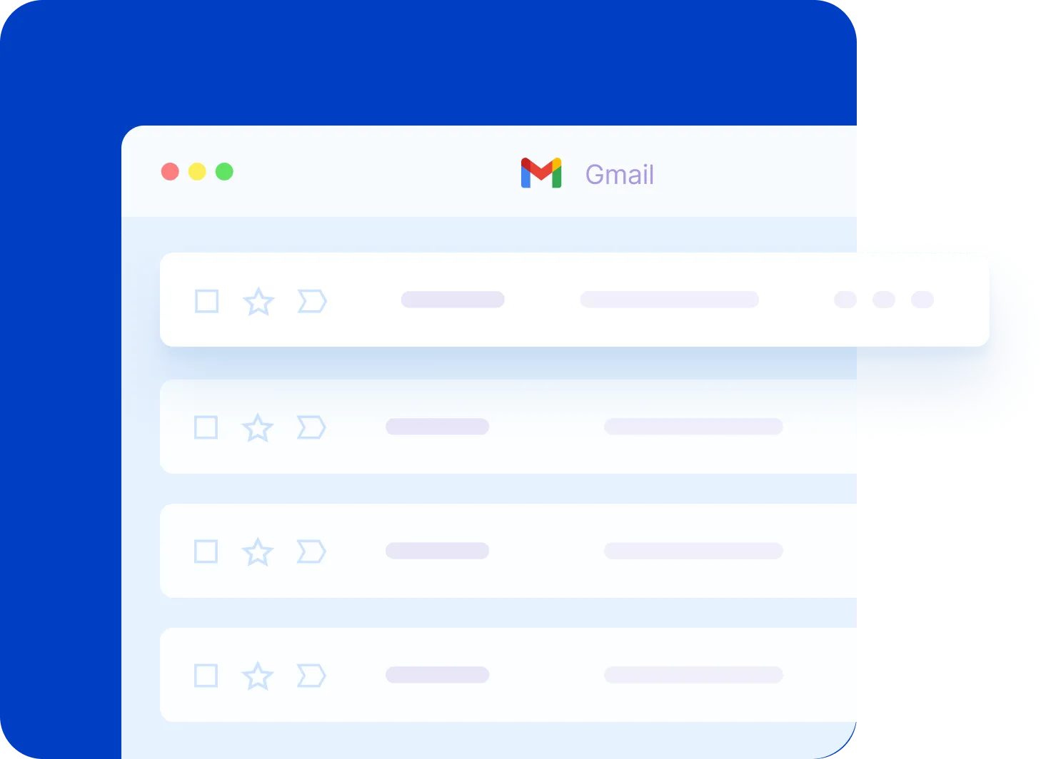
Google Calendar Essentials: Schedule Like a Pro
Are you new to Google Calendar or just need a refresher? From adding and editing events to managing multiple calendars and adjusting notifications, this video covers everything you need to know!
Google Drive for Desktop: A Step-by-Step Tutorial
Want to access your Google Drive files directly from your computer without opening your browser? In this video, I cover everything from installing the app to syncing folders and managing your files efficiently.


