


Don’t Use Trello as a CRM Without this Dashboard!
Viewing deal value and won data on Trello cards
I've said it before and I'll say it again, please don't use Trello as a CRM without Crmble installed. At first glance, you may think that this Trello board looks pretty typical. But if we take a bit of a closer look, you can see that there's some very important differences.
Number one, we have the deal value listed here on the front of many of our cards so we can see at a glance the value of these clients.
And second of all, and perhaps even more apparent, we have won and lost data visible on the front of the card so we can see which deals we have won and we can also keep track of the deals and why we lost those particular deals. But let's go one step further and open up one of our cards
Adding and editing customer data within a card
because maybe the biggest difference with using Crmble with Trello is that we have access to contact information right here from within the card. No longer do you need to copy and paste things here in the Description field or try to create a large number of custom fields which you can't report on.
You can't really do anything with custom fields that you create here within Trello. Rather, we have that contact information at our fingertips. We can create new contacts directly from each Trello card. And then, we can repurpose them as these customers perhaps come back to us for future sales.
Best of all, we can keep track of that won and lost information. And you know what? I just won this deal so let me select that button so we can keep track of that,
and more importantly, report on that information at a later time. Now these features alone make Crmble essential for using Trello as a CRM but it gets even better.
Accessing the Crmble dashboard
If I come up to the top of my board and select the Crmble button, I have access to the all-new dashboard. Now I can take all of that information, all of the contact information, all the deals that I've won or lost and view it here in something that is so much more meaningful.
Within the Crmble dashboard, I have a win summary in the top left-hand corner so I can see that we've won eight deals, which is better than the five that we won last month, and that we've just surpassed our goal of $20,000.
And even that is a little better than what we did last month at 20 and a half. On the right-hand side, I can see exactly who those eight leads are. If I click on any of these,
they will take me directly back to my Trello card. But here within the dashboard,
I can see which members of my team have been assignedwhen that particular deal was won and the value of the deal. At the bottom of this screen, I can also see a timeline view as to when those deals were won, seeing that certain days and certain weeks in particular have been better for us.
But keep in mind, when it comes to reporting your Trello information, this is just the tip of the iceberg.
Reports menu with filters
Here within the Reports menu, we have even more data to look at including our complete sales funnel here on the left-hand side.So at a glance, I can see that we have 28 new leads, 24 in-proposal review, and 18 as a part of a discovery call.
On the top right-hand of the screen, I can highlight and make sticky some of the most important numbers to me. So for example, maybe I want to make sure that we have at least 20% of our leads in proposal review.
I can keep this number visible to me at all times and if I want to change that to something else, I can maybe change this to a discovery call, for example, that's only at 11%, and I can save this view if I want to. We can also filter by that won and lost information.
So if I want to dive down a little bit deeper just into the deals in which we have won, I can use this filter as well. But speaking of filters, that's the real power of Crmble. Here on the top right-hand corner, I can dive deeper even further. I can specify the time range.
I can specify a member of my team. I'm just going to click on Alberto here so I can see what he's been doing recently and I can filter by label. And the great thing here is that you don't have to manage two different systems.
When I select Select labels, these are the labels which I've created within Trello. These aren't specific to Crmble. No matter how many labels I create within Trello, I will have access to them here within the Crmble dashboard
Include or exclude archived reporting data
and reporting features so I can make use of them. But the last checkbox here may be the most powerful and something that we don't want to ignore. As a Trello user,
you will know that you will need to archive certain cards after a certain period of time. For example, after you have won X number of clients, you don't want to necessarily keep them here within the finalized list, or maybe the same could be said
for your future call list. Eventually, you'll want to archive and remove them from the visibility of this board but you certainly don't want to remove themfrom its reporting capabilities. So if we go back to the Crmble interface and select Filters, you can see that I can choose to include the archived information or exclude it. In default mode,
you can see that this has been excluded. We have 28 leads but if I check this box,
it's now going to refresh that data. I now have 40 leads in total and all of my other information has been updated as well. With this simple checkbox, you can keep your Trello boards uncluttered but still always have access to that information right here from within Crmble.
View and import/export contacts
Continuing on the left-hand side of the screen, we have our complete contacts list.
So all of those contacts, which you or members of your team have added within those Trello cards, will remain here so you can quickly and easily find them and dive in a little bit deeper. In this example here, I can see that Ahmed is actually attached
to four different Trello cards here. So I can quickly see at a glance where they are,
the dates related to them when they were created, and the information related to them as well. And of course, if I click on these cards, they will take me directly back to that Trello card. Here on the top right-hand corner, we can also add new from this screen but perhaps more importantly, we can import from any other CRM system
or maybe some other spreadsheet that you are maintaining. And if you ever need to export your Crmble information, you can do so via CSV or Excel.
Send email directly from Trello cards
But if you're still not convinced that Crmble is the best CRM solution for Trello,
let me show you a feature which is my personal favorite. Here we are returned to our Trello board and I'm going to go back and open up this card. Here's this card which we just selected as won a few moments ago. Now it's great that I have access
to their contact information directly here, both their phone number, their work, email address and of course, I can customize as many additional fields here if I like to.
Now I could select this little link here which would open up my default email client but why waste my time when I can email them directly from within the card? If I click on this Gmail icon here, you can see that I can write a message directly from within Trello.
It'll even give me the option to choose from which email address I would like to send this message if I happen to be managing several. Crmble also allows us to create and store as many different templates as we like.
So in this case, I'm going to choose the follow-up template and automatically that customer information is input directly within this template. Last but not least down below, the signature at the bottom, that's coming in directly from my Gmail account. I didn't even have to create this within Trello or within Crmble.
View sent and incoming email from Trello
It is linked directly to my account. Now by hitting Send, this email is sent to that particular client. And if I come down to the Activity section of my Trello card,
I have a preview, a snippet of that precise email. Best of all, if this client decides to reply to my message, their email will appear right here within the Activity section as well. I said it earlier and I'll say it again.
Please don't use Trello as a CRM without Crmble. To learn more and to start your three-week trial, go to crmble.com. And remember, being productive does not need to be difficult. In fact, it's very simple.
This FREE Chrome Extension Will Change the Way You Work!
Sidebar you can access anywhere
You probably spend much of your day here within your web browser, but what if I told you that there was a free Chrome extension that could make your life a lot easier and a whole lot more productive?
Well in today's video, we're taking a look at Manganum, a free Chrome extension which just might change the way you work within your browser.
Hello everyone, Scott Friesen here at Simpletivity, helping you to get more done and to enjoy less stress. And if I go back here to my Drive account,
I really do appreciate the Google side panel. Here on the right-hand side, I can access things such as my calendar, my notes, and my tasks, but the problem is, is that if I go to any other website, if I'm not within Drive, Gmail, or Google Calendar,
I don't have access to that information. Maybe I want to take some notes on the webpage that I'm on, maybe I want to access my calendar, I have to keep switching back and forth or going back to other tabs.
Well with Manganum, no more, because if I slide my cursor just to the left, guess what is revealed? A whole slew of wonderful tools which I can use to make my life that much more productive.
So let me give you a quick tour, here on the left-hand side as you can see, if I just drag my cursor to the left, it will automatically expand, and if I'd like to keep it permanently there, I can come down here and detach the sidebar so it's always available to me.
Don't like it here on the left-hand side, no problem, I can click and drag it, and really put it anywhere that I like. So what are the different features of Manganum? I thought you'd never ask. Let's go through each one of them one by one.
Launchpad for your favorite sites and apps
Starting at the top, we have our launch pad, and remember, all of these features will be available to you on every single page or every single tab that you access.
Here within the launch pad, we start with a Google search, and if we don't like Google search, no problem, we can also change our default to something else such as DuckDuckGo.
Down below, we have our favorites, where we can add the websites that we access most frequently or that we want to have access to, we can quickly just add a website here by entering in the URL and giving it a custom name.
Down below, we have websites that have been most visited, so these are the places that I've been to recently, and if I want to jump back in it, is quick and easy for me to do.
If I want to remove something, I can do that here as well by selecting the trashcan icon. And below that we have Google services, now, I've customized mine to show Gmail, Maps, and Docs, because maybe that's what I access most frequently, but if I go show more, you'll see the other options available to us as well.
If I want to bump up photos, no problem, let me just drag that up over here, I can say show less, and now I am just a single click away from getting to my favorite Google services as well.
But here within the launch pad, perhaps the most helpful tool I believe are the Chrome tools down below where I have one click access to some of the most frequently used or maybe things that you don't use that often but you forget how to get to them, such as clear browsing.
Let me just remind you, if we go the traditional way, I have to click once up here, then I have to click again for more tools, and then I have to click again for clear browsing data, so that's a total of three clicks to get to this screen.
Alternatively, with Manganum, all I have to do is select clear browsing,
and I'm brought immediately to where I want to be, so this is very, very helpful as you quickly get to the places that you would like, quickly get to the places that you want to access.
Add and view calendar events anytime
Next up, within the Manganum toolbar, we have our calendar, and even before I click on it or expose it, I can see that I've got something coming up in 36 minutes, so I can even see that at a glance to make sure that I don't forget any upcoming event.
If I click on that, that's going to expand my calendar, and here I have access to my complete Google Calendar, so I don't have to go switching back and forth or always keeping my Google Calendar tab open, I can have access to all of my events here
and even scroll through to look at a glance as well. If I want to create a new appointment, I can add an event here as well, and I find this especially helpful
when it comes to maybe jumping into a meeting, rather than digging into my email
or going back to my Google calendar tab, I can access that video conferencing link or phone number directly here by clicking within Manganum. The other feature that I particularly like with the Manganum calendar is that beyond just telling me when my next meeting is coming up, it will actually give me a pulsing warning.
Here under settings, you can turn this feature on or off, but if something is coming up within three minutes, you'll see a gentle glowing, a gentle pulse here on the left-hand side of your screen.
Let me show you how that works in real time, here you can see with the Manganum toolbar completely minimized, I've got this soft little amber glowing flash
in the left-hand side of the screen, notifying me that I've got an upcoming meeting. And the great thing is, is that it doesn't matter where I go, if I go to another website,
I'm still going to see that flashing] in the left-hand corner. I can come over here and be reminded, oh, that's right, I've got that meeting coming up in just two minutes time.
Translate language on or off screen
Now below the calendar option, we have a translator, so if we want to quickly type in something and translate it into another language, we can do so here with just a click of a button.
But Manganum makes it even that much easier, here I've come across a website where I'm not exactly sure what the language is and what it's all about, so what I'm going to do is I'm just going to select this text here, and automatically without even clicking anything, it's going to put it into this box, identify that it's Italian,
and translate it for me automatically.
I don't have to do a single thing, all I had to do was select the text that I want translated and it will do the rest for me. And if I need to copy that, it gives me a helpful copy link as well, if I need to paste that somewhere else. It even has audio if I want to listen to it in its original language, or in the language which I've chosen.
Easy access to your task list
Below the translator, we have our tasks, and yes, these are our Google Tasks,
so regardless of where you create the task, it will remain perfectly in sync. In fact, in some ways, I almost like the layout of Manganum's tasks better than the original Google Tasks.
I can still rearrange anything here, I can create a new task here, let me just add a quick new task here. I can add further details, I can go ahead and add a due date, and if I want, I can add sub-tasks as well. Even the sub-task feature seems almost a little more intuitive, a little bit easier to use than the original Google Task.
But have no fear, regardless of where you create these tasks, either here within the Manganum side panel or within Google Tasks themselves,
Quick notes on any page
it will stay perfectly in sync. Now below our tasks, we have our notes section, now unlike the calendar option and tasks, notes are not synced with the familiar Google product, Keep notes.
These notes are only available and attached to the Manganum sidebar, but I still think it can be a great asset as you're wanting to take some very quick sticky notes or other pieces of information, depending on the website that you're visiting.
And just like Google Keep, you can make additional edits such as changing the background color, and of course, we can drag and move these notes
in any order that we like. I find that the notes area is ideal for daily quick notes, maybe things that you're going to remove or declutter once a week or once a day,
but it's so much easier to grab them here rather than having to go to another tab
and find them somewhere else.
Read text messages
Now, the final option available to us within the Manganum taskbar is brand new,
just release this month, and that is SMS, yes, if you would like to access all of your text messages, you can do so right here on the sidebar as well. Now as of this recording,
you cannot respond to your messages, but you can link it directly to your phone
and also receive the same type of pulse that we saw earlier with the calendar if you want to be notified of a new message. So you can view your contacts and view all of your SMS incoming messages directly here from within your browser.
New tab to stay focused
But wait, there's even more than the options here on the left-hand side of our panel.
When you open up a new tab with the Manganum extension installed, you'll be brought to this screen here where you can customize your background and the other options available to you. Here you can see I've got a nice pleasing video background here, I also have the local weather and my local time in the top right-hand corner,
but I can also help myself to be a little more focused and productive by putting in the next task that I want to accomplish, right here at the bottom of the screen, so maybe for me, it's recording this YouTube video, and when I'm complete, I can check it off,
and then add a new one to focus on for the rest of the day. Manganum also gives us an option if we want to view a motivational quote, if we want to have an affirmation,
or in this case, a life timer, which tells me that I have an estimate of about 35 years left, so I better keep on keeping on. Now if you'd like to start using Manganum for yourself, you can go to the Chrome Web Store and install it for free, or you can also go to manganum.app to learn more and install it from the official website as well.
And if you'd like to learn the seven most valuable Chrome browser shortcut keys,
be sure to watch this video next. Thank you so much for watching, and remember,
being productive does not need to be difficult, in fact, it's very simple.
5 Easy Ways to Organize Ideas with Walling
Tag and filter ideas in Walling
Do you want to capture your ideas quickly and easily and then be able to visualize them in a way that makes sense to you? Well, in this video I'm showing you five different ways to organize all of your ideas right here within Walling.
One of the reasons why I keep coming back to Walling is just how easy it is to capture and input information. In this example, I'm looking at redesigning a website homepage and the very first section which I've created is Ideas.
Now in this example, I already have a couple of bricks where I've started to input many of my ideas but if I want to add more all I have to do is double click anywhere on the screen. And maybe I'm going to suggest that we get rid of the slideshow on the homepage.
I can give that as a title here. And then if I want to add some further details, this is slowing down the load time of our home screen, something along those lines there.
Now of course I can add a lot more information here as well including the ability to tag this because this would really be more of an SEO issue in this case. And if I really want this one to stand out, I can also come over here and maybe give it a distinctive color. In addition to text,
we can also make images stand out as we're collecting our ideas. So for example, take a look at more 3D graphics. Maybe that's something else that I'd like us to include. So in this case all I'm going to do is paste an image that I found off of another website and it's nice and clear.
It doesn't just add it as a simple attachment
so I need to go and open it later. If I want to see the image in its full screen I can do so here, but it's just that much more stimulating. It's going to be that much more easier
for myself and members of my team to take a look. Again, I'm going to add a quick tag here because that would fall under the design category but we can also add more complex elements as well. Here you can see I've added a note about adding responsive images.
And if I come down here to the Insert tab you can see the wide range of different things in which we can add including a Code block. So in this case, what I'm going to do is paste a pieceof code, which I grabbed just earlier and now I have it right here as a part of my ideas.
So no longer do I have to reference something to someone else. Now they can come in here, grab this piece of code and actually add it directly to the project or the webpage that we're working on.
And maybe just for further clarity if I want these code snippets to stand out even more
I'm going to give each of these bricks just a different shade or a similar shade I should say, so that they stand out and we can see that they're grouped together.
But if we want to go one step further and be able to filter or save some specific views, we can do that here as well. And that's where the many different views and filters
and the ability to pin those filters become so important. In this case, maybe I want to add this All view to the top of my section, therefore I can just quickly click on this and see everything rather than having to disengage or clear a filter.
But let's add a few more. I'm going to add one here called SEO. I'm going to create that view here. And then what I'm going to do is apply a filter to it. So if I apply this filter her I only want to see the tags that have SEO applied.
I'm going to say filter. That filter is on. And what I can also do is now pin this to the top as well. So if I need to toggle between all of my ideas and see everything within this section or if I just want to narrow it down to SEO
I can do that here quickly and easily. And now just focus on the things that I want.
Board and Kanban view
Now the second way in which we can quickly and easily organize our ideas is by using a Kanban method. I'm going to add a new section down here called Copywriting. So this is where we're going to add some additional ideas here.
But instead of having it visual I'm going to select a Kanban option here as well. So for example, maybe I'm going to add a section called Taglines. I'm going to add another one here called Descriptions.
And then maybe a last one, which is going to be, Call to Actions. I think it's important for us to remember that the Kanban style of viewing your information doesn't have to mean, to do, doing and done or moving things together.
Maybe you would prefer a more column styl or grouping things together as in this manner. Let me go ahead and add a few examples. Now you can see that I've grouped my ideas under these respective column headings, so it's easy to see and easy to work with.
And if I want to, of course I can drag and rearrange that content as well. And don't forget, you're not limited to just adding colors to the bricks themselves, but you can add them to the headers as well.
So in this case, maybe I want descriptions to stand out a bit more because that's where we're lacking the most. I can give that an accent color here as well. And regardless as to how you structure or lay out your ideas, Walling makes it so easy for us to include images or other files.
Let's say in this note here, under descriptions, there's that PowerPoint which is directly related to this. All I need to do is drag and copy it, and now I've got that file directly embedded here. Easy access for myself and my colleagues when we're discussing this particular idea.
Detailed section breakdown
Now, a third way of organizing your information within Walling is by creating a section for one specific topic. Sometimes we can be tempted to create bricks
which have a large number of bullet points, but sometimes if they're too lengthy or too long, things can get lost. So in this case I want to discuss about our target audience here. So I'm going to create a new section called Target Audience.
And instead of creating one brick what I'm going to do is create several bricks
that have key headings or key statistics. So maybe my first brick will be called, Key demographics.That's where we want to focus on those specific numbers and specific data about our clients.
I'm just going to copy and paste the key information for this brick, and then I can add something next to it. Maybe something like, Preferred platforms. What are our clients actually using on a regular basis?
So in this case I can just list things such as, maybe Facebook and YouTube and if I have relevant information to go along with that I can do that as well. Maybe LinkedIn is another place that we want to focus on. And lastly, maybe preferred devices.
Where are people finding us? And should we be more focused on that when we're creating our new website? And maybe we understand that 82% of our clients are finding us on mobile devices. So things like this, we can organize in a bit more of a linear fashion,
key pieces of information that stands out without having to group all of this within a single brick. Also, keep in mind if you need to make edits or changes you can customize each of these sections.
Here you can see under my Target audience I've got three different columns, but if I need more I can come in here and adjust that to my needs. Now I can add another key metric or another key area of my Target audience, and again, keep things nice and slim, nice and compact before I add my next section.
Viewing files in a section
And for that, we're going to look at our fourth way of organizing our information. And for this, I'm going to call this section Files and Assets.
How often have you been looking for a particular file, a particular image, or something else that is relevant to the project that you're working on or the thing that you're brainstorming with?
And sometimes it can be difficult to find it within the brick or the area which you've created. That's where creating a Files or Reference section can be so helpful.
Now, rather than going to find things one at a time, again, Walling makes it super easy to bulk import files and assets. Here on the right hand side, I have a collection
of files that I would like like to add to this section. But just before I do I'm actually going to change the section view from visual to list, and I'll show you why. I'm going to select all of these files and simply just drag them into my list here under Files and Assets.
And what it's going to do is bring all of those files in here easy for me to see and access. Now, you could still change the view here if you wanted to but I find that the list view is perhaps the most functional.
Now because it's a list, it's going to show some check boxes and due dates and who it's assigned to. Don't worry, we can make some simple adjustments. At the top of every section we have the opportunity to customize that section.
So for example, I can remove the Mark complete I can remove the Due Date and the Assigned in this case. So maybe I want to leave the Tags because I'm going to be adding some tags later.] Whatever you are creating
or whatever section you are building out, you have so many different customizable options available to you. And just like with other bricks within Walling we can make our files stand out as well. Maybe I want this particular PDF to stand out.
I'm going to give it a red shade. And this spreadsheet over here I'm going to give it a slightly green shade just so people understand that it's a spreadsheet and maybe it's something that we use more often than the other files in this section.
Visual inspiration section
Now, the fifth way in which we can organize our ideas is by creating an inspiration section. And this is especially helpful if you're wanting to add a number of graphics, screenshots or maybe just links to other web pages or other resources.
Here I've titled this section Inspirations and I've got a number of images already on my desktop. I'm just going to click and drag, drop them here into Inspirations, and now I have them automatically added.
So I can come back in here and take a look at maybe some of the color schemes or some of the other things that we want to consider. But Walling also makes it super easy. If I want to grab this image, it's just click bring it up to my Walling tab and drop and immediately I have that image available to me as well.
So again, a great visual way of grabbing those graphics and keeping them nice and clean in their own section.
Now, I'd love to hear from you next. What questions do you have about organizing ideas right here within Walling? Be sure to let me know in the comments down below. And if you're already a Notion or Trello user you may want to watch this video to see why Walling may be a better solution for you.
Remember, being productive does not need to be difficult. In fact, it's very simple.
Ultimate Trello Setup (You'll want to copy this board!)
This video tutorial is brought to you by Rewind. Are you worried about losing your Trello data or not being able to go back to something you did days or weeks ago?
Don't, because you can always go back with Rewind Backups for Trello. A little more about them a little later in the video. If you go and do a Google search for Trello Consulting, do you know what you'll find? Well, you'll find me at the very top of the list.
No, not the advertisements here. I mean the very first listing. Trello training and consulting with Scott Friesen. Why is that? Well, I've been a Trello user for more than 10 years and I've been providing Trello Consulting for five of those years.
And along the way, I've learned what works and what doesn't when it comes to using Trello with businesses, with projects, really with any type of thing that you're wanting to manage within the Trello space.
So in this video, I'm going to help you build the ultimate Trello project management board, something that can be applied to virtually any industry
and even any size team. And best of all, it's not going to be some massive board. In fact, depending on your screen size, you'll be able to see all seven lists right here within a single board. That's right. We're only going to be using seven lists.
Now I'm going to be building this out live so you can follow along and also understand why I've designed this template the way I do. And yes, this is the exact same template that I use with most of my clients.
So let's dive in. Now, the very first list that we are going to create is not going to be called to do or tasks or projects. In fact, we're going to call it about this board. Why? Far too often, we are collaborating with members who are either new to this board or are managing many other Trello boards as well.
So it's important that we add some vital but simple details here so that they know what they're working with. Now, a few years ago, Trello added the ability to add an about this board area here where we can add a description to our board. But it's kind of buried here in the menu.
No one's coming here out of their own free will. We want to be up front and also be able to share other information here as well. So the very first card that we're going to add here is a description.
This board is used for, and I'm just going to leave it at that for our example here. But this is really intended for you to fill out a couple of sentences, maybe a very short paragraph, just describing what this board is used for and maybe who should be involved in this board.
I'm going to select add card. But before we leave that, we're going to make it stand out even more because otherwise this is just going to look like any other Trello card. So I'm going to open up this card and we're going to make use of the card cover feature.
Here on the right hand side, you can see near the bottom of our add to card options. I'm going to select cover. And in this case, I want to select this full cover option. Maybe I'll choose the color yellow, and then I'm going to choose the right one here.
And the reason that I'm doing that is that I want this text to be big and bold. Not only do I want the color to stand out, but you can see anything that I write within this card, within the card title is going to be big and bold.
So we want to be clear and upfront as to what this board is used for. Now, the second card in this about this board list is going to be for reference, and particularly reference documents or maybe links to other websites.
And once again, I'm going to click on this card and make use of that card cover feature, because again these are things that we don't want to mix or sort or move with other things on this board. We want it to stand out.
So I'm going to use this sort of reddish shade, but maybe I'll leave this card cover here. I don't need it to stand out as bold. In fact, I'd like them to see if there are links to other documents.
Now remember, we don't want to replace Trello for our cloud storage system.] If you're already using Google Drive or Dropbox or OneDrive, that is really the ideal place to keep your files and important documents. But maybe there's something particular to this board that people will be needing to reference on a regular basis.
That's where we can use this card here] and attach certain documents. So under attachments here, we can either link to specific webpages, we can upload PDF files, maybe there's certain images that you would like to be included here as well.
It's that much more handy to have them all in one convenient card, or at least many of them in a single card, so people don't have to be switching between this board and other tabs or other areas on their computer.
The next one on our list is also going to be a type of reference, but here it's going to be labels used on this board. Of course, you can name this any way that you like. I'm going to open up this card, and in this case, once again, just so it stands out a bit, I'm going to make use of that cover feature.
Maybe I'll use the blue color this time around. Now, because this is a brand new board, I actually haven't added any labels. All of these labels are waiting
for me to enter in some options. But let's just say I'm going to give them a few different titles. Maybe this is a priority label here with green. I'm going to save that. Maybe yellow is going to designate that they are a customer. And then maybe one more here.
Let's just say that this one means urgent, something along those lines. Now what's important is that you want to apply all of the labels which you've created to this particular card so it will show up on the front of this card. So when people are looking at what's going on, they can see all of the labels that are available to them.
And don't forget this Trello tip that if you don't see the name of the label here on the front of the card, just click on the label itself. By default, you may only see the colors, but if you click on any of them,] it will expand and it will do that for the entire board.
So you can see clearly what labels are available. Now for our example, I'm going to stop adding cards to this about this board list. But remember, this is an ideal place where you can add reference material or other pieces of information that people would like to or need to go to on an occasional basis.
It's important that it's far left so that everyone can see it and also have easy access to it. But just before we start adding our next list, I'm going to do one more thing here to the title of this list.
And you're going to see me do this for all of the lists in this board as well. And that is to add an emoji at the front. This is something that I've started to do with really all of my boards to make them stand out that much more.
So in this case I've decided to add a little notepad just to make it look like it's a reference style or a reference emoji here.
This is not only helpful as we go through the other lists in this project board, but it's especially powerful when it comes to things such as sorting or maybe viewing your Trello board in the other views here within Trello.
Can also be very helpful when you're accessing Trello] on your mobile device. So something that stands out and makes each list a little more distinctive. So I'm going to start with my emoji here.
I'm going to look for something that's maybe a brain. Why? Well, the very first list where we're starting to take some action and I'm going to title this one brainstorming.
Now, you could title this something such as ideas or things to consider, but I think it's very important] that every tri board has a place where we can dump information, whether it's yourself, maybe it's a personal board, or especially when you're collaborating with a team, you have a safe place where you can input new ideas, new tasks, new things to consider.
But they haven't graduated to an actual task or perhaps an actual due date. So this first location here for brainstorming is going to be where you can maybe triage on a weekly basis, come back and revisit.
Maybe there's some things that will immediately get archived or be deferred to another time, but something that is related to this particular board, the type of work that you're doing, but you can input it on the same screen.
Our next list is where things start to get done, or at least we start to organize the things that we want to accomplish. And again, I'm going to start with an emoji and I think I'm going to pick this finger pointing down because this is where a lot of our attention should be.
Now, you can call this to do or task to accomplish. I'm just going to leave this as to do. But there's a great distinction here between things that we're thinking about or things that we're considering and things that we've committed to. I think it's really important
whether you're using Trello for your personal task list or working on a huge project with many other colleagues that there's a distinction that everything in this to-do list are things that we've committed to, not just ideas, not just things that we'd like to consider. That's what brainstorming or maybe a completely separate board is for.
To do means that we're going to accomplish it. Now at this stage, you may think that the very next list in this list should be done, right? Here are the things we need to do.
And then when they're complete, we move it to done. But there are more than one important list that we want to put in between our to do and our done or completed list, because there are many phases when we are working on a project or even working on given tasks.
So the very first one that I'm going to put in here is in progress, meaning that someone is actually working on this. And don't forget our emoji here, just to make it stand out that much more.
I'm going to use these tools that we're actually working on something here and add to this list. It's so easy to create a to-do list, but who is actually working on that task in the moment? Why are there so many things on our to-do list? Probably because other people are working on other tasks, and we want to spell that out and make it exceptionally clear right here within our Trello board.
Next, I'm going to add a little hourglass to this particular one here. Why an hourglass? Well, I'm particularly using this image here that says hourglass not done because the name of this list is going to be pending.
Now, what exactly do I mean? And what is the difference between in progress and pending? Well in progress means that it's something that you or someone else is actively working on.
But I always like to include a pending list for things that cannot be worked on any further until someone else either gets back to us, someone else delivers a part of work, or maybe replies to an important email.
How often have you been working on a task and you're working within a collaborative environment such as Trello and people maybe ask you, hey, why haven't you finished that task yet? I see that that's been assigned to you for some time.
Meanwhile, what you're doing is actually waiting for a response maybe from a vendor or from a client or waiting for someone else to finish up a portion of their work. Rather than keeping that task within the in progress list, I think having a pending list is much more appropriate.
Now, chances are you will only have very few things here within this pending list. But again, it's about making that distinction between our different stages and our different lists here within Trello.
Pending means that I am waiting for a response or there's nothing else I can do at this moment in time. And don't be afraid to move your cards back and forth between in progress and pending depending on that task, and depending on what information that you're waiting for.
We are also going to add a list which I'm going to start with a stop sign because this means that that particular task or whatever that card represents is actually blocked and you or perhaps other members of your team need some help.
Now, this is a list which is often not used very regularly, and hopefully there is never more than maybe one or two cards in this list at any given time. But especially when you're collaborating with others, I think it's important to have a place where you can call out something and say, listen, I can't get any further with this particular task.
Can I get some assistance? Can someone answer this question? Maybe someone else can bring another alternative. This can also be a safe space for you to put things that can be discussed perhaps at the next team meeting.
Or better yet, you could set up a Trello automation that whenever something is moved into the blocked list, perhaps everyone on the board gets an automatic email notification so that they are aware of that particular task and can jump in and help as needed. If you'd like to learn more about Trello automations,
be sure to click the video here in the top right hand corner of your screen. And now that we have our first six lists added, really there's only one more list that I think we need to add. And yes, that's going to be complete.
I'm going to select this checkbox here, and we can either title it complete, finished, done, whatever you think is most relevant to you and the needs of your particular project board.
As you can see, minus the about this board on the far left hand side of the screen, everything fits in nicely on a standard resolution desktop screen. So we can start our task here in the brainstorming mode.
They can graduate to a to-do and then work their way sometimes through pending, hopefully not very often through blocked, but always to its completed end so that you can efficiently get through your projects.
Now, one more bonus tip is what to add at the top of each of your lists. And what I would recommend is adding a brief description, something along the lines of this.
This list is for tasks that are waiting for input and cannot proceed without that information. After adding that card, I would recommend that you open the card and once again make use of that cover option.
In this case, maybe I'm going to use this green shade here so that this card stands out and won't be confused with other tasks or other cards within this list. Now, are you ever worried about losing your Trello data? Or about someone else messing up your Trello boards? Well, don't be.
That's where Rewind Backups for Trello come into play. Rewind provides automatic daily Trello backups and allows you to restore your boards in just seconds. And best of all is the price.
Rewind Backups starts at just $1 a board per month, so you can be rest assured that your Trello information is safe, secure, and always retrievable. To learn more and get started, go to rewind.com/Scott-Friesen.
And remember, being productive does not need to be difficult. In fact, it's very simple.
How to Create Signable PDF Documents (Tutorial)
Getting started with Jotform Sign
Do you want to quickly and easily create documents that you can send to your customers to sign? Well, in this video, I'm going to show you how to create, send, and manage your legally binding documentsin just a few clicks.
To get started, we're going to go to jotform.com and come over here to products and select Jotform Sign.
Now, Jotform is best known as an online form builder, probably the easiest and most powerful builder on the market. And that's great when it comes to document signage because, really, what we're talking about here is a type of form, but we also want to keep track of what is happening.
And, yes, Jotform Sign is free for up to 10 signed documents per month. Once you've signed into your Jotform account, our first step is going to be to come up here and select Create Sign Document.
Now, you can upload any type of PDF document to start creating your signed fields, or you can come over here and select one of the 600 plus ready-made templates.
So, regardless, if you are creating a bill of sale, or a rental agreement, or some other legally binding document, chances are you'll find a template here. But let's go back and show you how easy it is
Upload a PDF and auto-detect fields
to upload your own PDF. So here, I'm going to upload a document. I have something here called a certification form. I'm going to select that. I could add multiple documents at a time if I wanted to. And I'm going to say Create Signable Document.
Now, what it's going to do is not only just upload the document at this point, but it's also going to try and detect those fields. You can see here, at the top of the screen,
it says, detect fields automatically? And we are going to say yes, detect those fields. Jotform Sign is now going to analyze this PDF and see if it can identify all of the fields where we need to sign. And it's done a really, really good job.
You can see all of these blue highlighted areas where it is going to allow the user to input information, whether that's a student number, whether that's a checkbox, and, of course, the signature and date details down below.
Now, I'm going to say Keep All, in this case,
but if there happens to be a few that are missing, no problem. That's where we can go and add our fields here on the left-hand side of the screen.
Add or edit your own fields
So it didn't capture this phone number here. All I need to do is drag this Phone field over and drop it in. Let me just place it here, and maybe I want to space it out just a little bit so it fills this entire field.
And then, on the right-hand side, I can make some additional options if I want to. If I want to change the field label here, or maybe I want to make it required, I can make that option here as well. Really, Jotform Sign gives us a number of advanced options.
So, for example, if I only want to accept phone numbers that match a specific format, I can choose that here and other advanced options as well. In this case, there's one other field that wasn't captured here. No problem.
I've got this little plus button. It recognizes that it's probably another checkbox. Let me just move that up here so that it is in line. And perfect, now I've got that option here as well. In this case, I'm going to want to add what that last option is.
It is the Change of Visa Status or Other. And this is going to be very important.
What I love, of course, is that Jotform Sign has already put in all of this text for me. I've only had to add this last one because it didn't quite catch this last checkbox. But remember, regardless of what you upload into JotForm Sign, all of these fields are now customizable.
Now, at the very top corner of the screen,
Preview document and mobile view
We can always go and preview our document. Let me just toggle this switch, and it's going to show me what this is going to look like for the person that I send it to.
Now, at first glance, you may say this doesn't look very different than what we saw on the other screen, but let me show you one of the key benefits of using a service like JotForm Sign.
Here, you can see, if I decide to click in the Last Name field, rather than entering it directly into this blue shaded area, it's actually going to prompt me for my first and last name, even though the order of the form is last and first.
What I love about this is that it's making it a little smart because we're so much more used to entering our name first and then last. I can hit Next, but it will correctly put it in the right place.
But these smart fields make it even easier for the recipients who may be accessin or receiving this document on a mobile device. Let me go to the phone preview just to show you very briefly.
Now, of course, the field itself is going to be quite small because, yes, it's a PDF document. But no problem. I can't read these checkboxes. If I start to click on any of them, I am brought up with the full field, which makes it so much easier for me to select my options.
I'm going to select Next. Yes, my major is going to be a commerce degree. And yes, my second major is going to be in the arts. So I don't have to be constrained by zooming in and out of this form.
It makes it that much easier for me to fill out this form regardless of the device that I'm viewing it on.
Adding and managing signers
Coming back to our editable form, we can also highlight who is supposed to sign
or fill in which fields. In this case, you can see that everything has a shade of blue,
but if I scroll down to the very bottom, there's an academic advisor's name. Let's say, in this example, that is me. I don't want the student to fill out this information. I don't want this even to be available to them. Well, all I need to do is click on this field.
And down below, you can see that it's currently assigned to Signer 1, but if I select this dropdown, I can say no, I want to assign that to me. I'm going to go to this next signature. I'm going to make the same change, assign to me, and the date should be assigned to me as well.
Now, you can see that we have a different color indicating that this portion is for my signature, my input, but everything else will be up to the student. And of course, you can have more than just two signers.
You can have multiple signers and put them in a specific order. When we are happy with editing
all of our fields in our form, we want to next come up to Settings. Here, we can give our document a specific or different title than the one that you uploaded. You can also come up here and customize your email settings.
So the default subject will be your signature requested for the particular form, and I can add a custom message down below as well. Lastly, you can set up specific integrations.
So, if you want your signed PDFs to go directly to one of your favorite third-party cloud storage systems,
you can do so right here. So, if there's a particular folder in Google Drive, Dropbox, OneDrive, or many others, you can have those signed PDFs go directly to that location. Lastly, we want to come over to the Send tab.
And here, you can see the different recipients. Now, I'm, of course, the Me, that orange shade. Here is my name, and here is my email address. But who are we going to send it to? Well, in this case, I'm going to send it to a test account. Let me input that email address here.
And now, you can see I have Signer 1 and then myself. But we can also customize these options as well. So, for example, it's going to make the most sense in this form that the student, Signer 1, signs first, and then I sign second.
In that case, I want to select the signing order, where Signer 1 is number one, and then I will be number two. If I need to rearrange this, it's as simple as dragging and rearranging that order here.
But, in my case, I want to go back to that original order as we see. We can also select on the Options tab to set an expiration date. We can also send automatic reminder emails.
So, if someone doesn't sign that document right away, you can choose how many days, or maybe even every day, that you'd like to remind them until they've signed that document.
And now that we've double-checked all of our settings, we can select Send To Sign. Jotform Sign will then show us exactly when the form was sent and which signers have been included.
But remember, I won't receive the document just yet, not until the first signer has completed the document.
Managing the signing workflow
Now, within the Jotform Sign inbox, we can keep track of all of the forms which we have created and sent out and also see what the status of those forms are. For example, here you can see that Waiting for Others, we have the document which we just sent out three minutes ago.
So here, I can see that I am waiting for this individual to sign before I can add my signature to the document. You'll notice that I don't have anything waiting for me just yet because I need this individual to sign the document first.
Here, at the top of the screen, we can also make selections such as canceling the document or sending additional email reminders if necessary. But let's jump to our email inbox and see what the user experience is.
How it looks to your users
Here, within my test account, I've just received my invitation to sign that document.
Remember, this is the inbox of signee number one. If I open up this email, you can see it's clear and straight to the point. And of course, I can customize this message if I like.
By clicking the button, it will open up the Jotform Sign viewer, where I can quickly and easily start filling out this sign. Jotform Sign will also try to bring in relevant information,] such as my first and last name, which is already populated, and today's date.
So there are just a few less things that I have to worry about when filling out this document. Once I've filled out all of the required fields, I can come down to the bottom of the screen. Here, I can fill in my name, then add my signature.
Now, of course, I can either use one of the defaults here and change the style or color,
or I can choose to draw my own signature as well if that is preferred. And now, I can choose that date if I need to change it.
Otherwise, I can stick with the default. When I'm all done, all I need to do is select Sign & Complete at the top of the screen, and by accepting and send, this is a legally binding document.
And now, if I jump back to my Jotform Sign inbox, you can see that Waiting for Others has nothing, but now there is something waiting for my signature. And yes, here is the form that the student just completed and filled out below.
Now, what I can do is proceed with signing this document. At this stage, as the second signer, I can choose to review the document and then add my signature down below. And as you saw when we set up this form,
I only have these three fields available to me. So I can add my name here, and then I can add my signature, let's just go with that one there, and say Accept and Send.
Back within the Jotform Sign inbox, I can see the completed document with both signatures and also see a full audit trail and document history, so when the invitations were sent, when they were viewed, and most importantly, when they were signed.
So, if you'd like to collect e-signatures quickly and easily, be sure to check out Jotform Sign by clicking the link in the description below. And if you'd like to learn
how to create your own free mobile app, be sure to watch this video on the screen right now. Thank you so much for watching.
And remember, being productive does not need to be difficult.
In fact, it's very simple.
5 Simple Time Saving Apps You’d Wish You’d Known Yesterday
Save articles and videos for later
Sometimes it's the simple things in life that can make the biggest difference.
So in this video, we're looking at five productivity tools which are very easy to use, but can have a big impact on your day. Hello everyone, Scott Friesen here at Simpletivity helping you to get more done and enjoy less stress.
And the first tool that we're looking at here is pocket. Now pocket is all about clipping and grabbing pieces of information on the internet so that you can read it in a distraction free environment Let me show you how it works.
Here on the web, you can see that I have the pocket extension available to me here in the top right hand corner. So let's say I'd like to read this article but it's a 13 minute read I just don't have time for it right now.
So instead I can come up here and select the pocket icon and instantly it is saved to pocket. If I like, I can add some tags or put it in a particular list, but let's keep things simple for our example.
Next up, let's say I grab this article here which I would like to read through as well, but I actually don't have time and I also don't want to be bogged down by all of these images as I go through this content.
Once again, I going to hit the pocket icon and in one click it is added to my list. Lastly, pocket also works for other content, such as videos. Here's a video that's a half hour in length.
I don't have time right now, but maybe I will later this evening. Once again, all I have to do is hit that icon and it is added to my list. Now, when I go back to pocket and select my list,
you can see that I have both the article, these two articles, and that video added to my list. And the great thing is, is that it's not just going to send me back to that webpage. I have a reading focused environment to do so.
Let's click on this therapy article as an example. When I click on it, you can see that all of the advertisement is taken away. I can just focus on reading this article without all of the other distractions.
If I go back and if I select something like the YouTube video, for example, I'm not brought back to YouTube. I can watch it right here within the pocket player.
So again, I'm not distracted by other things, other advertisements, or perhaps other videos. I can just focus on the content that I want.
Copy text from videos
Now, the next tool on our list is also about gathering information, but information which is often hard to get at. How often have you been watching a video and perhaps someone has put up a large quantity of text, and you'd like to take those notes to be used somewhere else or just maybe for your own personal reference.
Well, you could pause the video here and take out a notepad or try and write it down in your note taking app. But with the Selectext extension installed, you can see that there's a new button in the top left hand corner of my video.
If I select this it will automatically find all of the text on the screen. Then I can click and drag and select just what I want, and when I release it is automatically copied to my clipboard.
I can then go into any other application and paste that information and use it for my own purposes. Here is another example, from the very same video where the author has just pasted a screenshot of a particular email.
Once again, I can enable select text and now all of that text is selected. I can just select what I want. I don't need this copyright down below. And again, I can now go and paste this information wherever I like.
Selectext is a free Chrome extension and works on almost all video sites including Skillshare and even university lecture recordings.
Create step-by-step guides
Now, speaking of learning new things let's see how we can create a user friendly guide either for ourselves or for others, so that we can remember how to perform certain tasks. And for that, we're taking a look at Scribe. Let's get started by looking
at what a finished Scribe looks like. If I open up this one, titled Google drive sharing tip, you may think that I captured a number of screenshots and then I came in and had to type in this text and then add things like this orange circle.
But what if I told you I didn't do any of that? In fact, it took me only 55 seconds] to create this entire Scribe. The way that Scribe works is to record yourself doing those precise actions
and without changing a thing, Scribe will record where you went, what you did, and will even automatically zoom in and highlight where you clicked. Let me show you how easy it is to create your own Scribes.
In this example, I've returned to the pocket website. And perhaps I'd like to show someone how they can change pocket to dark mode but also change the layout of their list.
All I need to do is come up to the Scribe extension and select start recording. What Scribe will do, it will confirm that the capture has started and in the lower left hand corner you can see this lightly blinking light, letting me know that everything I do from now on will be recorded.
So first I'm going to come up to my list because this is where we're going to change the layout.
I'm going to click on my icon and I'm going to select this option down below. This is what I think they are going to prefer when it comes to their list layout. But then I also want to change it from light to dark. So I'm going to select dark as well.
And lastly, I'm going to click off of the menu so that they can see the page in front of them. When I'm finished with whatever it is I want to show, I can come down here and click complete recording.
This will bring me to the Scribe interface where I can see the entire Scribe but also edit for minor changes. So for example, by default it's saying this is the get pocket workflow. I might want to come up here and say get pocket dark mode and reading layout, maybe something a little more descriptive there.
I can add a further description if I want. Scribe is going to show how many steps are included in this guide and also how long it took for me to record it. Now, keep in mind I was going extra slow and narrating along the way, something that you don't need to do.
The first step is to navigate to, well, to your get pocket site. And if this is something too specific, again, we can edit anything here as well. Maybe what I'm going to say is just go to getpocket.com Click my list.
That's what I did. Then I clicked here and then I clicked this icon. If I want to be more descriptive, again, I can change the title then click the dark field and then click here. Actually, I didn't need to click here.
Did I? I only clicked here in this last step just to remove this screen. So I'm going to come up here and say, delete this step. When I'm finished with any minor edits,
I can come up here and select done. Now I'm ready to share this Scribe. I can either share a direct link, so I can send people to this Scribe, or I can also export it to things such as PDF.
Or if you upgrade to the pro version, you can export to other formats as well. If you'd like to use Scribe for free be sure to click the link in the description below.
Automate your favorite apps
Now, the next service on our list has been around for a very long time but continues to evolve as it connects more services and allows you to create your own custom triggers.
IFTTT, which stands for, if this then that, allows you to create your own custom applets. What is an applet? Think of it as a recipe when you want things to do something specific and perhaps between two or more services.
In my example, I'm going to come up here and select the create button. And here you can see the basic recipe which is waiting for inputs from me. Now, in my case, I want to be alerted of when things are snowing at my local ski resort.
So my trigger, I'm going to select if this and I'm going to select the add button. In this case, I'm going to look for a weather service. Now I could start scrolling, but I I highly suggest that you start searching for either keywords or key apps and services.
I'm just going to type in weather. And in my case, I'm going to choose this one which is called Weather Underground. Now, under this service, you can see there's a large quantity
of different triggers, which I can set up. But in my case, I want to look at this one here.
Tomorrow's forecast calls for, because I only want to receive a notification when something specific is in the forecast for tomorrow. I'm going to select this one and now I can choose a few other specific conditions.
Mainly what is the weather condition I'm looking for and at what specific location? So here, I'm not looking for rain. I want to be notified when it's going to snow tomorrow.
So I'm going to select snow and no, I don't want just a general location. I want something a little more specific. So I'm going to type in silver star, perfect Silver Star Resort. That's the address I want it to look for.
I can select create the trigger. So now we know the if, but what do we want to do about it? If there is snow in the forecast how do I want to be notified? Well, that's the 'that'. Here I'm going to select add again and I can choose another service.
Now, in my case, I'm going to be looking for an email. So I'm going to type in Gmail and I'm going to select that option.Next, I can choose a specific action for Gmail. Because I want to send this email to myself, I'm going to select this middle option.
But if I wanted to notify other people, I can send to up to 20 recipients, I would choose this one here. Let me select this middle one. And yes, that's the account I want to send it to. I can customize things such as the subject line tomorrow's condition tomorrow.
That means this is going to say snow tomorrow, right?
Because that's what I'm looking for. And here's the body of the text. Of course I can customize any of these fields if I want to. But in this case, I'm going to leave it as is.
I'm going to select the big create action button. And now my applet is almost ready. I'm going to select continue. And I will see a summary up above. If tomorrow's forecast calls for snow then send yourself an email from this address.
Last but not least, let's select finish. And now this applet is ready to go. I will receive an email the day before if there is snow in the forecast at my local ski resort.
Set limits for distracting websites
Next let's take a look at a free extension which helps us with avoiding distractions.
Limit is a free extension, brought to us by Freedom which is all about trying to block out how much time we spend on particular sites. With the limit extension installed, we have a very simple interface which we can use to either add additional websites and also limit how much time we spend on those websites.
Now, by default, you're going to have a collection of roughly 10 websites listed here. And yes perhaps some common culprits such as Facebook, Instagram, and Twitter are listed.
And by default, it's going to give you a limit of 25 minutes, but you can customize this for each service. Maybe I want to allow myself 60 minutes on YouTube but I only want to give myself about 15 minutes on Instagram each day. If I want to add additional websites,
I can come up here and just paste in the URL. Lastly, if I want to see a visual indicator
as to how much time I've spent on a website, I can toggle this switch at the top. But remember whether you toggle this on or off if the limit extension is installed, it will block you from all of these sites after that limit has been reached.
So with amazon.com as an example, let's go to the amazon.com website. Here, you can see I'm on the home screen and really nothing out of the ordinary, but because I have that show timer turned on in the top right hand screen, it's going to tell me exactly how long I have been on this site.
And although you might find this distracting,
it can be a helpful reminder that you don't want to spend too much time on this site.
In fact, I really appreciate that it doesn't show a second by second countdown.
It only updates every 10 seconds. So it's a little less distracting as you navigate around the site. But because I've set Amazon for 25 minutes, once 25 minutes is reached, this site will no longer be available to me until the next day.
And if you're looking for even more ways to stay productive and to avoid distractions, you're going to enjoy this video on the screen in front of you. Remember being productive does not need to be difficult.
In fact, it's very simple.
How to Make Google Forms Look Amazing!
Upgrade your fonts
Are you suffering from boring-looking Google Forms? Don't worry. In this video, I'm going to show you five different ways in which you can make your forms that much more engaging. Hello, everyone, Scott Friesen here at Simpletivity helping you to get more done and enjoy less stress.
Now, the first thing we're going to do] that's going to make our form look a lot different from everyone else is by changing the text and the fonts. In fact, this is something that we've only been able to do in the last little while.
If we come up to the top and select, customize theme, you can see that we now have a text style area where we can change both the header, the question, and the text itself.
So rather than just using the Roboto default, that even sounds pretty ordinary, doesn't it? I'm going to come here and I'm going to select something like, oh, I don't know, maybe Impact, something that's going to really make my title stand out.
Next, we can change the question,which I think is rather important. So that the question stands out and is a little more bold than the answers themselves. In this case, I'm going to choose a font called Lexend.
And if you see a font that has a little arrow to the right, you can see that you have other additional options in terms of the size of the boldness or maybe if you want something extra thin.
In this case, I'm going to select, semi bold, so that those questions really stand out.] They really differentiate themselves from the answers, and I can see at a glance that there's only three questions in this particular survey.
Last but not least, you can also change the text of the answers, and this will also apply to the description of the survey as well. But I'm going to leave that as is. Already, this survey is starting to stand out and look different from a standard survey.
Add animated header image
The second thing that we're going to do is to add a header image, something that's going to be a little more eye-catching at the top of our form. Now, typically the first place I like to visit when it comes to finding images is Google Images.
And what I'm going to do is do a search for background GIF, because what you can do is add a moving image to the top of your form. I was already looking at this one here.
And if you click on these images, the GIF will be in play, so you can see what that's going to look like.] All I need to do in this case is right-click, and I'm going to choose, save image as.
Then, back in Google Forms, under the same customized theme pullout, I'm going to select, choose image, for the header. Our first option is going to be able to choose from one of the default themes, which are selected here.
And there may be something worthwhile looking at, but keep in mind, every other Google Form user
is presented with these options as well. In this case, I'm going to select, upload, browse, and I'm going to go find that image that I downloaded just a moment ago.
Once the image is uploaded, you will notice that you will be pre-selected with the size and dimensions which will fit to your form.
Here you can see the entire image in the background, but if I want to drag this up or down, maybe I want something just a little bit lower, right about there, that's what I want to include in my form.
I'm going to select done. And in just a few seconds, it will add this to the top of my form. And remember, because I chose a GIF in this particular example, yes, there's going to be something moving.
So when they access this form, already it's going to be that much more engaging
Make your background stand out
for them to interact with. The other thing you will notice whenever you upload any type of header image is that Google Forms will try to match those colors for the background color and the other accent colors within the form.
You can see that this light blue in the background and this somewhat darker blue up top is being pulled directly from my header image. But I'm going to suggest that you go one step further
and make your colors even a little bolder. By default, Google Forms has a habit of selecting a fairly light color for the background. But because we have a white background here for the questions themselves, I suggest you go for something a little darker.
This makes your questions stand out even more.] And don't forget, you can always add your custom colors to your color palette as well. Now that we've changed the look of the form, both by an image color and text, let's see if we can make some of the questions and the layout a little more interesting.
I'm going to come down here to this last question
Limit checkbox choices
where I'm asking, which color do you like the most? And I've given the user five different options. Now, we need to be careful when it comes to some of our questions, because in this case, I'm asking for a favorite or only one answer. But you know what?
I might actually get more valuable information if I ask them to select their two favorite colors or maybe three favorite colors, not just their number one favorite,
because maybe I like blue the most, but orange is a very close runner up.So in this case, we're going to create a selection of checkboxes and then set a limit as to how many they can select.
Our first step is to come over here to the dropdown, and we are going to select checkboxes, but we can't leave it in this state. Why? Well, this is going to allow a responder to check as many or as little checkboxes as they like,
and that's not going to give us very valuable data. First off, I should probably change the question so they know what to do. Maybe I'll say, please select your two favorite colors. Something like that. Now, we can't leave it as is, we need to select these limits.
In order to do so, we're going to come down to the three dots here and we're going to select response validation. This is going to allow us to choose a minimum, a maximum, or a specific number.
The first option here is select at least. So we can either say there's a minimum, select at most, a maximum, or select exactly. Now, because I've framed this question as please select your two favorite colors, I'm going to say select exactly.
I'm going to come over here and type in the number two. It also gives us the option to type in a custom error text message. So here, I'm going to say, please select two, and maybe I can add an exclamation mark if I want to.
So now when someone is presented with this question, they will need to select exactly two from the answers given. If you ever want to remove this validation, you can always come over here to the far right and click X.
But let's see what this will look like for the user. I'm going to select the preview button and now we can see what the form will look like to our users. Let's scroll down to that last question, please select your two favorite colors.
If I select orange, immediately it's going to say, please select two. Now, it's true, this warning message is always going to appear, even if they are in the process of selecting others. If I go and select blue, perfect, I've filled the requirements.
It will allow me to check another box, but once again, I will not be able to submit the form because I have this error message in place. So I'll have to choose between red and orange, and yes, I'm going to deselect red, and now I can proceed with submitting this form.
By the way, I'd like to thank Rondalene for asking this question
about how to use limited checkboxes. If you have a question about how to use Google Forms, be sure to let me know in the comments down below.
Create multiple sections
Lastly, let's take our forms to the next level by adding sections. Sections can be extremely helpful, especially if you have a large number of questions, and rather than sending the full page to a responder, you can break up your survey into different sections.
In order to do so, we want to come over here to the sidebar and select the last option, which is add section. This will add a section to the very bottom of the screen. Now, there won't be anything listed there just yet.
We can either start to add our additional questions or we can drag other questions into this section. So in this case,] I'm going to call this just maybe page two or continued, or maybe you want to break up your survey into different themes or different titled components.
Now, I could either hit the plus button and add a new question to this section or what I can do is grab an existing question and drag it into this area. Now when someone opens up this form, all they will see are these first two questions, and then they will see the next button, which will bring them to this next section.
Now, you are not limited by the number of sections which you can create. So I've seen some people actually create a form where there's only one question per section. It can allow the user to really focus in on that question before they start scanning for other options on that page.
You will notice at the bottom of a section there will be a dropdown option. Now, by default, it's going to say, after section one, continue to next section. And in most cases, that's going to be the behavior you want.
But if you have multiple sections, you can send them to a specific section at any time or maybe you want them to submit the form at that time. I'm going to select that preview button once again, and here you can see I'm only given the first two questions.
If I hit next, I will then be brought to page two, and here I have the option to choose my colors. Because I'm in preview mode,
it has saved my selections from last time. Of course, this will not be present when you send it to your users. Now, if you'd like to learn how to use conditional logic where you can send people to a specific section based on their answers, be sure to check out this video where I walk you through the process.
Thank you so much for watching.
And remember, being productive does not need to be difficult, in fact, it's very simple.
7 Helpful Websites That Will Save You So Much Time!
Remove things from pictures
Are you wanting to save time and spend less effort? Well, in this video I'm sharing with you seven helpful websites which will allow you to get in, get out and get on with the rest of your day.
And let's dive in with website number one, magiceraser.io. Now Magic Eraser is designed for you to remove certain elements from any images that you upload. And as we land here on the home screen you can see a perfect example here as we are removing a car from this image.
But let me show you just how easy it is to use this tool. Here you can see, I can either drag an image or click an image to upload. So there's a particular image here that I would like to upload and make some adjustments.
So right away, our cursor, as we hover over the image, is going to show this circle. And if I click and drag, let's say I want to remove this tree in the background. All I need to do is click and select the area that I would like to remove.
Now you can unclick and move to a different section. Maybe if you want to remove multiple elements but in this case, let me just finish covering the tree. And then down below, I can hit this button Erase and in just a second, the tree is gone.
And what I love about this tool is that you may have noticed that that tree trunk actually went down below this chain link fence but it didn't remove the chain link fence. It knew that I just wanted to remove the tree.
Now I can adjust the brush size if I want to. If I want to make it larger or if I want to make it smaller. Maybe I find that this lamp over here
is a little distracting as well. So I'm just got to cover this as well and then I'm going to hit Erase. Perfect. Now there's a lot more focus on the person where I want viewers to pay attention and I can download this and post it on social media or use it in some other format.
Now you can always go back and hit the undo button. Here you can see that that lamp is now removed. Although I can't redo. So if I want to go back and remove this lamp I'll actually have to cover it one more time and you can also go back to the original as well.
So if I want to go back to my brushed version and the original version I can do so here. Now when you're happy with your finished image you can come to the top of the screen and select Download.
Note for free users the maximum size is 600 by 600 pixels. But if you would like to download the full resolution or a higher resolution you can upgrade to their premium plan.
Productive background sounds
Number two on our list is all about blocking out distracting sounds in the background
or perhaps creating noise that will get us in a more productive state. And for that, we're taking a look at Noisli. Now there are many different websites available to us
that will produce background noise or background sounds including YouTube.
But what I like about Noisli is that it allows us to customize our own mix and even save our favorites. So here in the middle of the screen you can see that we have a few different icons.
And if we hover over them we see that this is a thunderstorm. These are leaves. This is a summer night. And if we click on one of them, let's click on this summer night for just a moment. (crickets chirping) You can hear we've got a few crickets.
We can adjust the mix and the volume but we can also combine them together. So maybe I like the sound of water, (water sloshing) but maybe I like the sound of water combined with rustling leaves. (water sloshing) (leaves rustling)
Maybe a little too much water. So I'm going to bring this down a bit. So a little bit further in the mix. Now you can combine as many of these different sounds as you like, and of course adjust the volume.
It even gives us three different flavors of white noise. If that's something that you prefer as well, but once you've got a mix that you like, you can either save it as a favorite. You can see if I click on my Favorites, I have one called forest with a stream.
It's a combination of this one here and this stream here. (birds chirping) (water spattering) At the very top of the screen we can also take advantage of a timer. Now, by default, it's going to be set to 25 minutes but you can adjust that time as well.
So if you want this sound to fade out or finish after a certain time, you can do so here. Noisli is absolutely free. So you can save your favorites and adjust your combinations and use the timer up above.
However, if you would like additional sounds to access you can upgrade to their pro plan.
Create free polls
The next website on our list is going to be the easiest way for you to create a quick poll and then share it with friends or colleagues. And for that, we are going to Polls.io.
Now, yes, it is true. We can create polls on Twitter, Facebook, Zoom and many other applications, but sometimes you don't want to share that poll with the world. You just want to share it with a few people, a few specific people, perhaps via email or by another messaging service.
Here at Polls.io, immediately, you can start typing in the question and the options down below. So maybe I'm going to ask what is your favorite Radiohead album? That's my question. Down below I can give my options.
Maybe "OK Computer". Maybe "Kid A" and maybe "In Rainbows". Something like that.
Now, if you need more than three options you can always select Add another option because I probably should add "The Bends". But in this example, I'm going to select Create this poll. Our poll is now live and we can share it with as many others as we like.
Directly to the right of the question you can see this purple share button. By selecting this what I can do is either copy the link or if I like, I can copy the embed code and put it on my own website. You can see I can also share it on popular social media platforms as well.
Easy email management
The next website on our list allows us to spend a lot less time within our inbox. SaneBox has been cleaning up email for more than a decade. And the great thing is it's available for Gmail, Outlook and Apple mail clients.
So regardless how or where you manage your email SaneBox can help it keep it uncluttered. What are some of the key features of SaneBox? Well, number one, rather than managing and creating complicated filters, SaneBox won't allow certain sender from getting buried.
It will also add a snooze feature if your email client doesn't have such a feature. It will also banish annoying senders and emailers for good. So rather than finding that unsubscribe link you can select the option here right within SaneBox and be sure that you will never hear from them again.
And last but not least, it even includes a do not disturb feature. So you can focus on the messages at hand and not be distracted by incoming mail. Now, if you're tired of drowning in all of that email I have a special offer for you.
If you go to sanebox.com/Simpletivity, you can sign up for the free trial and get a $25 credit if you choose to continue with the subscription. To learn more, see the link in the description below.
Improve your writing
Now, the next website on our list is going to make your writing so much easier for everyone else to read. Here we are at hemingwayapp.com and you'll notice we've got a lot of color going on. We have some sample text here, but what I often will do
is copy and paste something that I'm writing and just plug it right here into the app.
Now you'll notice that the colors that are highlighted, both the sentences and some specific words, correspond with some colors here on the right hand side of the screen. So for example, it's telling us that we are using two adverbs meeting the goal of two or fewer.
Two or fewer? Well, it's looking at the total number of words and seeing what's most appropriate to make this easy and readable for your viewers.
I can see quite clearly where those adverbs are located if I want to choose to omit them or perhaps change them. Green means the use of the passive voice. Phrases in green have been marked in a passive voice.
And again, it's saying that I'm within a respectable range in this particular case. I can also see that there is a word which has a simpler alternative. Now this can be really, really helpful.
If you are wanting your readers to understand and especially if you're looking at a global or international audience you may want to avoid harder to define words. So instead of utilize, maybe I can say use, and yes, it will even give you suggestions.
So you can click on the simpler word. The last two are sort of a light yellow and a pinkish color.
Yellow meaning sentences that are hard to read. And then the pinkish color meaning sentences that are very hard to read.
With this helpful knowledge I can then identify these sentences. In this case, perhaps if I just add a period and then capitalize this next sentence, you can see that this is much easier for people to read. You will also notice that Hemingway will give us a readability grade.
In this case, a Grade 6 grade
which it's identifying as good. Meaning someone who has completed a grade six education should be able to understand and follow along with the text on screen.
Faster marketing copy
Now, speaking of publishing and creating great written content, let's take a look how we can use artificial intelligence to create better writing. Here we are at Copy.ai
and really it's what the name suggests. We can write a variety of copy, from Facebook advertisements to blog articles, to complete webpages, all with the assistance of artificial intelligence. Once you've signed up for your free Copy.ai account you can see the wide variety of different projects which we can create.
Everything from product descriptions to website copy, blog articles, even brainstorming and sales copy. So to get started all I need to do is provide a few simple answers to three important questions.
Number one, what is my product called? Well, in this case I'm going to say it's called Google for Everyone. Something like that. Then describe your product. Now remember, we want to allow the artificial intelligence do most of the work so we don't have to be very lengthy with this description.
I'm going to say this is a course that will teach you how to use a variety of Google apps and products. Maybe something like that. And then lastly, we can choose our tone. Now by default friendly is going to be selected but you can see,
we can choose from professional to adventurous, to empathetic or persuasive.
In this case, I'm going to keep it with friendly and I'm going to select Create Content.
Now with our new batch of results, let's take a look at this first option here. Google for everyone is a self-paced course that will teach you how to use a variety of Google apps and products. You'll learn how to manage your email, create documents and presentations, work on projects with others, organize your calendars and task list,
increase online security and much more. I think I should create a product or a course exactly around this. So at the very least, Copy.ai will give you some fantastic ideas.
So whether you need to create advertisements, marketing copy, or complete articles,
Copy.ai will prevent you from staring at a blank page.
Install multiple apps at once
Now, the next website on our list is something that I wish I knew about years ago. Here we are at Ninite.com. Now Ninite is specifically for Windows users who want to quickly and easily install or update all of their favorite apps with just a single install file. Here you can see in step one, you can pick and select all of the apps you want.
So let's say I'm starting out with a new computer or perhaps I just want to make sure
all of my most important applications are up to date. So I'm going to select the Chrome browser and Firefox. Maybe I want AVG security, Google Drive for Desktop.
I can install all of my popular messaging tools like Skype and Zoom and Thunderbird.
You can see, I can go into all of these different categories and select the files that you're probably already using or maybe you want to install just in a single click.
Once you've selected all of those applications, step two is to download your custom installer and updater. No matter how many different apps or services you select in your installer it is going to be the fastest way to both install and keep those applications up to date. Now, if you enjoyed this collection of helpful websites
you are going to enjoy this video next where I show you seven free websites
that you're going to wish you knew yesterday. Remember, being productive does not need to be difficult. In fact, it's very simple.
How to Quickly Convert Documents into Anything You Want!
Problem with most document converters
Uh-oh, I was just sent this 13 page document which I need to know about for my upcoming meeting. Problem, I got to jump in my car and get to that meeting.
I wish there was a way that I could summarize all this information and then maybe convert it to audio. Wait a minute, summarize plus audio? Yeah, that's exactly what I need.
Hello everyone, Scott Friesen here at Simpletivity helping you to get more done and enjoy less stress. And yes, it's a fact, dealing with documents can be some of the most time-consuming components of your day, but it doesn't have to be.
Whether you want to convert or translate or merge documents together, in this video, I'm going to share with you seven different tools which can help you do that so you can spend less time with your documents and more time focused on your work.
Now, when it comes to transforming your documents, you may first come to Google and type in something like convert to word and you'll find an awful lot of options here.
Maybe I'll click this first one, convert a PDF to word file. So all I need to do is select...
No, wait a minute. This actually isn't the conversion tool here. This is an advertisement
and how much do I actually know about this service? What are they going to do with my files? I obviously have to upload them first before I convert them. And then if I want to do something else such as translate or summarize, I'm going to have to go to some other website.
Workflow Central by Xerox
Well, there really is a much simpler and more secure way and it starts right here at Workflow Central by Xerox. Here within Workflow Central, we have access to seven different tools, which are not only powerful in and of themselves, but better yet,
we have the ability to combine these tools together. So in my example, I'm going to select summarize.
I'm going to choose where that file is from. Whether it's on my local drive or if I want to connect my account directly to my other cloud services, such as Dropbox, OneDrive or Google Drive. In this case, I'm going to stick with my local drive.
I just need to select browse and I'm going to go and find that very long draft document. Next up, I can choose if there's a particular page range that I would like to specify, but in this case, I'd like to summarize really the entire document.
I'm going to select next in this case and I can choose the summarization length. This is really great because I don't want just some default length, maybe I want to get about 20% of what's happening in this document.
It goes one step further by telling me do I want to specify is this a business document? Is it related to something legal? If you want to get even more granular, there is a large collection of specific domains so that it can pull out keywords depending on your use.
In this case, I'm going to select next and then we are brought to our convert to audio settings, which yes, I want it in English
and I'm going to select next. At this stage, I can give it a different name if I want to
and I can choose if I want to email it to myself, re-upload it to wherever it came from
within my cloud repository, or just download the file. This is what I'm going to select in this case and then select run.
Workflow Central will immediately start processing that job and will automatically download it to my system,there it is, as soon as it's complete. And now I've got a summary audio version of that document.
Just a little over two minutes in length, which I can listen to on my phone, in my car, or maybe right here on my computer while I'm doing other things.
How to hide sensitive information
But remember, converting to audio and summarizing your documents are just two of the seven tools available to us. Let's take a look at a few more. Here to the left, we have redact, which is probably the easiest way to block out sensitive information or specific words or phrases in just a few clicks.
Now keep in mind that Workflow Central supports some of the most popular file types, but goes way beyond just text files.
So whether it is a word document, PDF or text file, that is great, but you can also redact things such as JPEG, GIFs or PNG images as well. In this case, I am going to select a word document because there are a few names in which I want to blank out in this particular case.
Once again, I can specify a page range if I like, but I want to do the entire document here. On the next screen, we are able to choose a specific location and this can be so helpful if you want to, by default, block out credit card numbers, email addresses or things such as taxpayer identification numbers.
Since I have the United States selected here, it is bringing up some of the most common things which we would like to block out. Of course I can choose which one of these
that I would like to allow through or allow to be visible. But in this case, I'm going to leave them all here. So all person names, email addresses, and phone numbers should be blocked out. Now down below, I can also add my own custom words or phrases.
In this case, I'm going to choose the word reset, and I'm also going to choose the word Simpletivity because maybe I just want to share what I'm doing with this document, I don't want to let them know the name of the program, I don't want to know that I'm actually directly involved.
I'm going to select next and now we can run this transformation. With my job completed, I can now open up this PDF document
and all of those keywords along with specific names have been blotted out. Now I can safely send this to someone knowing that the names and keywords will not be visible because perhaps, I haven't gotten permission or I haven't confirmed these particular quotes from these particular individuals. I can safely share this knowing that they don't have access
Saving default settings for future documents
to sensitive information. Another bonus of using Workflow Central is that you can save any of your conversions. Here we are back in the redact menu and maybe this time I need something for Canada looking for specific information here, but I've also added some other specific words. When I hit next, I'll have the ability to save this
so I don't have to reselect those options or reenter those words. By saving this workflow, I can give it a custom name. I'm going to call this hide details and I can even choose my own unique icon. So maybe I'm going to pick something like, oh,
maybe like this checkboard and I'm going to choose this black icon and hit save.
Now you can see near the bottom of the screen I have my custom workflow. So the next time I need to redact a particular document and it fits those requirements,
I no longer have to choose those settings. When I hit next, it already has my specific location and those words ready for me to go so I can continue and go ahead and run this job.
Convert, translate and merge documents
Looking at the additional tools available to us, we can convert files to Microsoft Office documents, we can convert handwriting to text and we can translate into more than 40 different languages.
And what I especially like about the translate feature is that you can translate five languages at a time. So if I need to convert or transpose something, I can do it in a matter of seconds. Last but not least is the ability to merge,
which has quickly become my most used feature cause not only do I need to merge the same types of documents together, but sometimes I need to merge images with PDFs, with word files and a variety of other types and I can do so right here within just a few clicks.
If you'd like to learn more about Xerox Workflow Central and start using it for yourself, be sure to click the link in the description below. Remember, being productive does not need to be difficult. In fact, it's very simple.
How to use Google Docs and Keep Notes Together
Add Keep Notes to Google Docs
Did you know that you can share and link your Google docs with your Keep Notes?
Well, in this video, I'm going to show you all of the different ways in which you can share information between these two apps and stay tuned to the very end because I have a bonus tip for Google Calendar users.
So here I am within Google docs, and I'm about to set forth with an agenda and a pretty lengthy document about some of the things that we are going to be working on. The problem is, is that I've actually kept most of my notes here within Google Keep.
Maybe I've added a few ideas while I'm on the go on my mobile phone, and I've included a few bullet points and even a checklist over here, but how can I quickly and easily get that into my new document?
Well, rather than coming over here and trying to copy and paste this text, there is a much easier way. And in order to do so, we're going to make use of the Google side panel here on the right hand side.
Now, if you don't see the Google side panel, come all the way down to the bottom, select this little arrow to show the side panel, and you will see multiple Google apps, including Keep Notes.
By selecting this, we have access to all of our notes. But wait, it gets better because no, I'm not just going to copy and paste what I need, I'm going to make it so much easier on myself. If I come over here to this particular note and I select the menu, I can say add to document.
And there in just a single click, I now have that information inserted directly into my document. Maybe I also want to add this checklist that I mentioned before. Same thing, I'm going to say, add to document. And now I've added that checklist as well.
You will notice in this case it's going to convert the checklist into bullet points but I can of course edit that any way that I like here within the document.
Add Keep Images to Google Docs
The nice thing is that this also works for images. So let's say I want to add this image
into my document as well. Now I could use the same menu option and say add to document, but with images, it gets even better. This time what I'm going to do is I'm going to click and drag that image over here. And you can see wherever I release it,
wherever that cursor ends up, maybe I want it in between these two sections, I'm going to release it. And now that image is inserted. Let's just reduce the size of that a little bit in this case.
Maybe I want that last image, this circle image here with the documents, I want this near the bottom, again, I'm just going to insert it and paste it into my document. I'm going to resize it so it's a little more fitting with this particular document.
And so now in just a few clicks, I've added these several notes here from Google Keep directly into my document, and perhaps I'm almost done. I can continue to work the way I like by adding little snippets or short notes or images here within Google Keep and then bring them into the relevant document.
Add Keep Notes to Google Slides
Now you should note that this also works for a few other Google apps, including Slides. So maybe instead of a document, I'm putting together a presentation and I want to include these budget numbers.
Let's just say, add to slide. And if I want to add that image, I can just click and drag it, put it on the slide as well. Let's just resize it a bit, and perfect. This slide is almost done.
Add Google Docs to Keep Notes
Now while this is a super easy way to get information out of keep into your doc or slides, what about if we want to go the other way? Here I have a sample document
and perhaps I want to grab this quote or this sentence here and add it to my Keep Notes. Maybe I want to expand upon it, or I just want to simply remember it a little later. Well, we can do that here as well. The nice thing is that we don't even have to have this sidebar open or the side panel. All we need to do is select the piece of text
or images that we like and then select right click.
And near the bottom of our menu option, you will see something that says save to keep. By selecting that option, it's going to automatically bring in that snippet or whatever it is that you've highlighted into a Google Keep note. But it gets better.
Not only have we grabbed the text, but if I click on this note and expand it, you can see that it's actually added a link, a direct link back to this document. So if I open up my Keep Notes and here is that new note, and I say, where did I find this particular quote?
Or where can I find out more information? I have that link directly here. If I click on it, it's going to take me exactly to that particular document where I can go and find other sources or do whatever it is I want to with it.
Now, going back to Google Keep, we don't have to keep this link if we don't want it. You'll see that there's an X here. So if we want to remove the source, I can do so.
Take Keep Notes and link to Google Docs
But there's also an additional way in which we can link notes in Google Keep
to a particular document. Let's say this time around,I don't want to just copy a section
or an area of this document, but I want to take my own notes with this document.
Maybe I want to come back and think about some of the revisions I want to make.
Well, with the Google side panel open and with Keep selected, you can see that we have the option to take a note at the very top. As soon as I select take a note, you will notice not only am I ready to start entering in text, but it's automatically linked it to this document.
So maybe I'm going to write a note to myself. Let's discuss this article in the next meeting, something like that. I'm going to say done. And now I have that linkage back to this document. Again, going back to Google Keep, here is that new note, and I can go directly back to that document.
So you don't always have to single out or copy a selection of text. You can simply take your notes here. You'll notice when we return to the document, that note will always be shown at the top as a related note.
And yes, I could take other related notes to this particular doc. All of my recent notes will still be available to me down below, but they are separated between related, meaning related to this document, or slide if we have that open up,
and recent, meaning all of the other notes available to me
Copy Keep Note into New Google Doc
from Keep Notes. But wait, there's even more ways in which we can find useful connections between Keep Notes and Google docs. Now, for some of you, you may be creating your documents or articles or blog posts or whatever you do within Google docs right here within the docs interface.
But for some of us, we like to collect those notes and maybe ponder and put together a draft right here within Keep Notes. Example, I have an article that I've been working on here which is rather lengthy, but it's almost finished as well.
I'm almost ready to publish. So I'm ready to put it over here into Google docs. But once again, instead of having to open it up
and copy and paste everything here, I can come down to the more menu and select copy to Google docs. By selecting this option, it's going to copy everything within the note to Google docs. I'm going to say open doc, or I could just go to my Google drive menu.
And now I have that entire note right here waiting for me so I can add further images or maybe do some more complex formatting, maybe finish this off before I'm ready to publish. So I can start my draft or I can start elements of my notes right here, and then copy it directly, the entire note right into Google docs.
Now it should be noted that there is no sync or link between these two. When we select copy from this option here, it really is going to be copying that particular note. If I start to add or make changes here, nothing will be reflected here on the Google Keep side.
Add Keep Notes to Google Calendar Events
Now, as I promised at the beginning, I have an additional bonus tip for those of you who use Google Calendar and also want to connect it with your Keep Notes. You will notice that the Google side panel is available to you here as well.
So if I open up Keep, I have the ability to start taking notes directly from this window, but we can also connect our notes directly to meeting events. Here I have an upcoming meeting
and I want to take a few particular notes, but I don't want to add it in the description of this event because I don't want to share it with those whom I'm meeting with. I'd rather take my own note here and then reference it when the meeting arises. So with this meeting selected within Google Calendar,
I can come up to Keep Notes and say, take a note. And you will notice, not only is it ready and waiting for me to start inputting those notes, but I now have a link directly back to this event.
So I can say, let's talk about this before the meeting starts, or I can add all of my bullet points, all of my notes that I want to prepare in advance. And when I select done, I have a related note with this particular meeting.
It doesn't matter if you're viewing this calendar event from the main screen or if you open up the note in full view, you will have that related note available to you here.
But if we go back to Google Keep, here we have that same note, and yes, we have that link. So what meeting are we talking about? What do these notes refer to? We can quickly and easily in just a single click go directly to that particular meeting
in our Google Calendar. Now, if you enjoyed these Google tips and tricks, you're going to love my other drive and Keep Notes videos right here on the Simpletivity channel.
Remember, being productive does not need to be difficult. In fact, it's very simple.
Featured Videos: Get Organized Today
Mastering Gmail: How to Add Notes & Due Dates
Unearth the secrets of Gmail to transform your email management. This video uncovers a special tip that most Google users don't know but will change the way you look at your inbox.
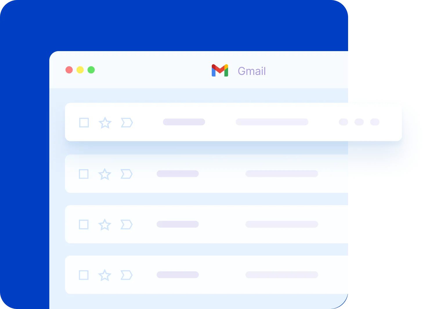
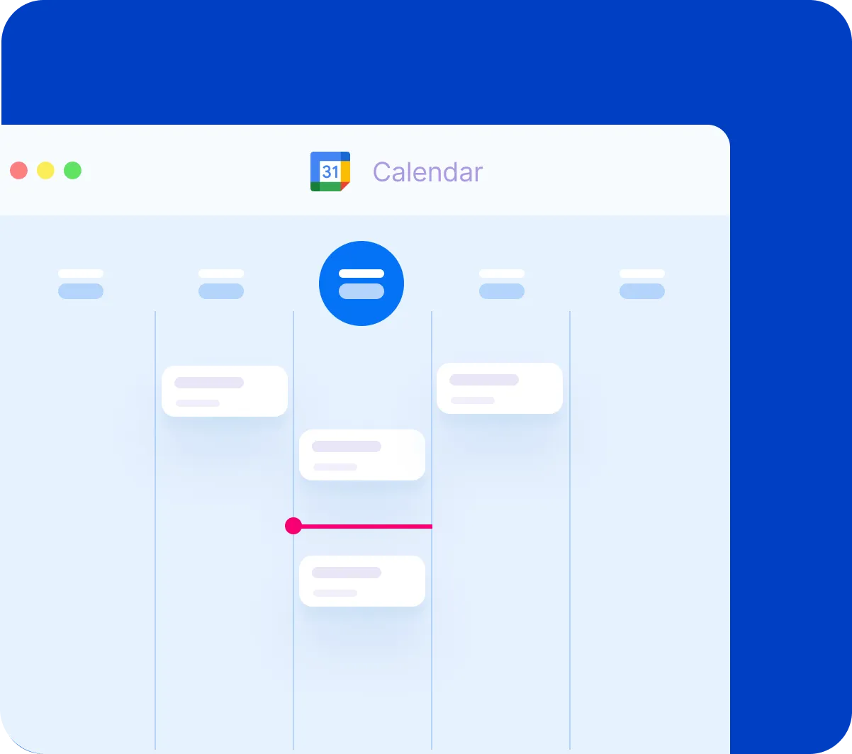
Google Calendar Essentials: Schedule Like a Pro
Are you new to Google Calendar or just need a refresher? From adding and editing events to managing multiple calendars and adjusting notifications, this video covers everything you need to know!
Google Drive for Desktop: A Step-by-Step Tutorial
Want to access your Google Drive files directly from your computer without opening your browser? In this video, I cover everything from installing the app to syncing folders and managing your files efficiently.


